Wednesday, October 31, 2007

Oil To Get New Unis in '09?

I hate to condone gossip, but a reader pointed out a very interesting article on SLAM! Sports. Not only does columnist Terry Jones "slam" the Edmonton Oilers' new duds, but he goes on to suggest a possible change in two years.

You can read the article in its entirety below, but I'll run down some of the bullet points:

  • Fans in general don't like the sweaters

  • Oil president hates them!

  • Oil CEO loves them!

  • Reebok is not to blame

  • CEO says Oil can get new unis in 2009-10


October 28, 2007

Threads of doubt

The jury's still out on the Edmonton Oilers new uniforms

O.K. Enough already. It's time to take the gloves off and deal with the No. 1 sports controversy in Edmonton.

Danny Maciocia's Gotta Go?

Hell no. Nothing left to say there that hasn't been said.

No, I'm talking about the total travesty of the Edmonton Oilers "pyjamas".

The folly and the farce of forcing them to wear "practice jerseys" in games.

Those especially embarrassing white away uniforms with the shirt tails it looks like they forgot to tuck in, that crappy costume they were wearing on Hockey Night In Canada out of Los Angeles last night.

The Oilers have been wearing these daffy duds long enough most of the fans I've talked to have only one question:

"How do we get our stripe back?"

O.K. Two questions.

"How do we lose that practice uniform piping on the front, too?"

The fans clearly haven't fallen in love with the Oilers new uniforms, home or away.

WORST IN THE LEAGUE

But the away whites may just be the worst in the league. In fact, they have been declared exactly that on sports desk highlight shows around the league already this year.

Heck, their own president Cal Nichols admits he can't stand looking at the damn things.

"They look, uh, a little plain," he chose his words carefully.

"I have to be careful here. Reebok paid a lot of money," he said of the project bringing the new uniforms to teams around the league and the obvious NHL memo to everybody in the game that they all must love them.

I told Nichols I was writing about the awful new Oilers silks.

"I think that would be a good article to write," he said. "But just put me down for saying I liked our old uniforms. I don't want to sound like an old stick-in-the-mud who can't go contemporary."

There have been other reviews.

"Ice Capades awful!"

"What was Edmonton thinking?

"I like the traditional horizontal stripes at the bottom of the old jersey."

"Why mess with tradition?"

"Wow. I feel like a Minnesota fan."

"Those are awful. Edmonton fans deserve better."

"Butt ugly. It looks like someone who hates the Oilers designed this one."

"The jersey is a little disappointing considering that Todd McFarlane, creator of Spawn, is a part owner. You'd think he'd have a say in the final design."

"Vancouver's looks better than those."

Those are just a few of the comments you can find by going to Google and typing in "Oilers" and "uniforms".

With the new Reeboks, everybody in the league has a new design, but the Montreal Canadiens look like the Montreal Canadiens, the Chicago Blackhawks look like the Chicago Blackhawks, theDetroit Red Wings look like the Detroit Red Wings ...

The Edmonton Oilers, a team of tradition which has won five Stanley Cup, just don't look like the Edmonton Oilers.

"I can't disagree," said Nichols.

WHO TO BLAME

Don't blame Reebok. Blame the Oilers. Blame CEO Patrick LaForge.

"We wanted change. A lot of things motivated us to look at change. We have a new locker room. A new team. We saw it as rejuvenation. A breath of fresh air," said LaForge.

"It was meant to be a sort of a Baltimore Ravens look," he said.

The Oilers have have their own identifiable look familiar to the entire world because Wayne Gretzky used to wear that uniform, and now they want to look like the Baltimore Ravens instead?

"A full black body from the ankles to the top, above the ankles and below the shoulders. A solid blue color," said LaForge.

So how do you get your stripe back?

"We can do it," says LaForge. "But not until 2009-2010."

Good thing they probably won't win a Stanley Cup until then.
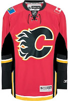
Flames, Here's How You Fix It

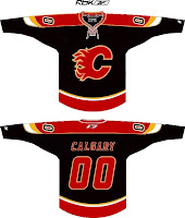
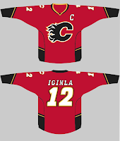
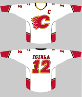
Haven't done one of these in almost a month. Got some good stuff, though. Here are some suggestions for the Calgary Flames on how to fix their new Rbk EDGE jerseys — not that they will.


On the left, we see two simple fixes. One, you drop a stroke around the Albertan flag since blue on red looks bad — but that's only true on TV and computer screens. When looking at the shoulder patch with my own eyes, I think it looks fine. Good, even.

And two, for the piping haters, let's grab the bucket tool and fill in everything below that black stripe. I guess that's preferable to dumping the stripe altogether. But what do I know? On the right is a different idea which involves switching to a black jersey with a red flaming C. It's also got a shoulder yoke that extends to the elbows. Of which, I am not a fan.


So then what about just simplifying? Ease off on all the striping a little. These here, they work. I'm still a little weirded out by the piping thing under the arms. Looks strange there. But I like the more classic feel of the arm stripes.

Anyway, those are just a few of many options for the Flames. But they're on the ice now. Nothing will change at least for a little while.

Sens, Flyers Art

I was contemplating a Freak Out post to celebrate Halloween tonight. But I don't really have enough content yet for that. However, if you want something Halloween-related, the Phantoms' second-round matchup against the Sound Tigers in the AHL Tournament of Logos just went live. Go vote!

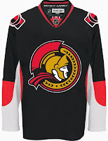
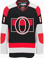
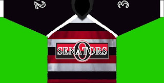
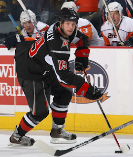
Anyway, today I've got a set of concept designs all from a single designer. Ninh Ly submitted a few items for me to share with the group. Despite taking a position as a professed Leafs fan from the other side of the pond, Ninh sure has a lot of Senators art.


I'm of the opinion that the design you see on the left is really what the Sens should be wearing right now. They're a black team, not a red team. But maybe I'm wrong about that. And as for the one on the right, despite it's obvious... issues, I sort of like it. Not the crest. But I think the stripes are all right. Not as hideous as that design would sound on paper.


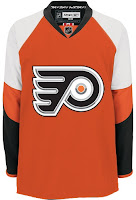
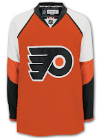
And finally, another stab at a Flyers third jersey. Very sharp. I could see Philly skating around in those. I do think orange is the way to go for them. Weird how I like black for one team and not another.

Anyway, if you got concept art of your own, you know what to do with it. I look forward to your emails.

Tuesday, October 30, 2007

Poll: Sabres vs Whalers


vs
Buffalo
SABRES
Hartford
WHALERS


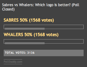
This is the deciding round for the Vintage Logo Tournament. Who's it going to be? Whalers or Sabres? Which is the best vintage logo in the NHL?

Place your vote and then feel free to leave a comment as to how you came to your decision. Tell all your friends to drop in and vote! The more voices heard, the more accurate the results!

Poll opening date
Tue Oct 30
Poll closing date
Sat Nov 3


07VNTRN | #4 | BUF70vHFD79

Monday, October 29, 2007

Guess What! Concepts!

There's no new poll today and I couldn't very well go without a single new post, now could I? Naturally, I have reader-submitted concept art to share. Let's begin in Pennsylvania.


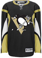
On the left is a great option for a third jersey — we've been told to expect one as early as next season for the Flyers. In fact, the team itself said so. On the right is an example of be careful what you wish for — because sometimes you get it.

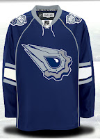
I really like the added use of gold on that Penguins jersey, little flightless birds don't have horns so a redesign would be required here. Next up is the Edmonton Oilers.


Not a bad idea for third jerseys, but those elbow stripes have got to go!

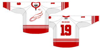
We'll finish with a concept logo for a team that will never change its logo, of this I'm sure.


It would never pass a professional sports logo, but if the Wings had/have some sort of foundation or something, it might make a good logo for that. Of course it's entirely possible I don't have a clue what I'm talking about. Wouldn't be the first time.

So that's that for today. Likely more to come tomorrow so keep checking in. I'm really trying to get done more than a post or two per day, but as you know, I have a Wii. It's pretty addicting.

Sunday, October 28, 2007

Rbk EDGE Uniform Ranking

The ratings are in! Here is the official ranking for the new Rbk EDGE uniforms as decided by you, the readers, here at NHLToL.

4.3Boston Bruins
4.1Montreal Canadiens
4.1Washington Capitals
4.0St. Louis Blues
4.0Chicago Blackhawks
3.9Columbus Blue Jackets
3.8Detroit Red Wings
3.8Tampa Bay Lightning
3.6Phoenix Coyotes
3.6New York Rangers
3.6Minnesota Wild
3.5New Jersey Devils
3.4Los Angeles Kings
3.4San Jose Sharks
3.4Ottawa Senators
3.3Philadelphia Flyers
3.3Pittsburgh Penguins
3.3Carolina Hurricanes
3.3Calgary Flames
3.1Vancouver Canucks
3.1Buffalo Sabres
3.0Florida Panthers
3.0Colorado Avalanche
3.0Nashville Predators
2.9New York Islanders
2.9Atlanta Thrashers
2.7Dallas Stars
2.6Toronto Maple Leafs
2.6Edmonton Oilers
2.6Anaheim Ducks


This ranking was reached by averaging the ratings chosen by voters in each of the individual Rbk EDGE Review posts. I reviewed all 30 NHL uniforms and within each review was a poll where readers could rate the uniform. See all 30 reviews.

All 30 polls will remain open forever so folks can continue to keep casting votes. The above ranking is based on results as of this morning. Any changes after more votes are cast would be negligible and wouldn't count for this ranking.

One other note is that despite how it may appear above, there were no ties in the rankings. For the purposes of this post, each rating was rounded to the nearest tenth of a point. For example, while the Canadiens and Capitals each received a 4.1, if you look further beyond the decimal, you'd see that the Habs have 4.146 while the Caps have 4.089, which is why the Canadiens are ahead of the Capitals. Make sense?

Hope you guys enjoyed the reviews! Please leave your comments below.

Poll: Barons Franchise Logos


SEALS
GOLDEN SEALS
BARONS


They were first the California Seals. Then the Oakland Seals. Then the California Golden Seals before moving to Cleveland to become the Barons. Finally, this franchise folded and merged with the Minnesota North Stars. But before they folded, which logo do you think was their best?

Place your vote and then feel free to leave a comment as to how you came to your decision. Tell all your friends to drop in and vote! The more voices heard, the more accurate the results!

Poll opening date
Sun Oct 28
Poll closing date
Thu Nov 1


07BONRF | RFCLE

Saturday, October 27, 2007

Red & Black

We've got a color theme for this concept post. Check it out.

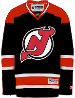
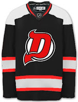
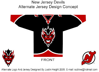
The most obvious place to start is the New Jersey Devils.


They both offer unique ideas for an alternate jersey. I don't think we'd really want to see the Devils in anything but red on a regular basis. Very interesting how these two different artists came up with something so similar yet so different.

But for something completely different, look no further.


That's a pretty scary logo. Looks like somebody's tattoo.

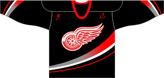
And here's a team you don't often associate with black.


The ironic part is the Ducks' template on a Red Wings jersey. Just so many things wrong with that. I know the Red Wings are sworn enemies of third jerseys, but I think they should try one out some day. Maybe not this design, though.


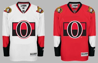
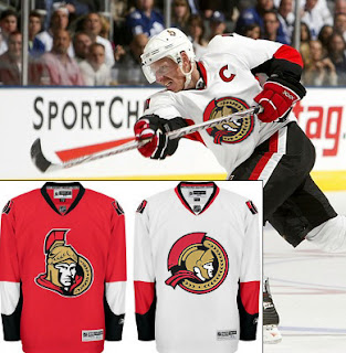
Another black and red team is the Ottawa Senators. Here's an example of what they shouldn't do with a third jersey. Ever. And here's another.


Now here's something that would work — even as a full-time road jersey. This 2D Senators logo is quite possibly better than the primary. It's unfortunate it's nowhere to be seen on their uniforms. Rumor was that it would be featured on various bits of team merchandise. If anybody owns anything with that logo, send me some photos.


And while we're on the topic of doctored photos of jerseys, more and more I'm in favor of the black/red/silver color scheme for the Buffalo Sabres — who are presently being conquered by my Lightning (that goes out to all my email hecklers).


Yeah, it's true. My Sabres-fan readers have taken to email trash talk. Well we'll just see how that goes, won't we? It's 2-0, not five minutes into the second period. Hope you're watching.

UPDATE (9:33 PM): Sadly, I may have spoken too soon with regard to the game. It's now tied.

UPDATE (10/28 8:17 AM): Stupid overtime.