Thursday, September 20, 2007

Sizing Your New EDGE Jersey

Earlier, I posted photos of my new Lightning Rbk EDGE jersey that just got delivered to me today. Since then, I've been getting lots of questions about sizing. So here's what I know.

The Philadelphia Flyers have a great FAQ posted on their web site regarding the Rbk EDGE jerseys. Specifically, they have a sizing chart that seems like it would give you a decent idea of what size jersey to buy for yourself.

Basically, it suggests jersey size based on chest size. So wrap a tape measure around your chest or something and figure out which jersey is right for you.


Obviously, the numbers above are in inches. I didn't realize they had a sizing chart until after I'd purchased my jersey, but as it happens, my chest measures out to about 43 or 44 inches, meaning medium was the suggested size for me. And it worked out because, as I've said, my jersey fits me perfectly.

And might I add, if you do end up buying a jersey and feel like supporting NHLToL, click on one of my IceJerseys.com ads and place your order with them.

I'm going to add this information to my Rbk EDGE FAQ. Let me know if this works out for you guys. Good luck!
Rebranding The Panthers

We've seen some great work from this guy in the past. He's redesigned images for the Ottawa Senators and Boston Bruins as well as the New York Islanders, Atlanta Thrashers, and Anaheim Ducks.

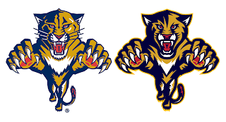
GhettoFarmBoy has now posted his Florida Panthers redesign. In this instance, however, his concept isn't so much a complete overhaul, as a rethinking of that which we already know.


He simply reworked the current primary logo a bit. Sharp work if not familiar. He basically simplified it in areas and added more curved lines to replace straight ones.


He kept the secondary logo, essentially, the way it was. Overall, though, the biggest issue I had with the logo was that the panther itself seemed a little cross-eyed compared with the old one. Others on the SportsLogos.net message board felt the same, so he reworked the eyes a bit.


A great improvement. The new eyes make the animal feel more cat-like.

The jersey designs are also pretty nice. Again, they still feel more familiar to me than anything else. Certainly an improvement, but not to the point that they're downright amazing the way his earlier Ducks redesign was.

I commend the work being done by this artist though. I think he has a real talent and it's a shame the NHL doesn't hire peole like him to handle uniform and logo designs. I think it would be a much better looking league if they did.

I should also point out that he's said his next "rebranding" will be the San Jose Sharks and that we should expect the New Jersey Devils soon as well.

Personally, I'm pulling for the Lightning, just to see what he comes up with.

Now the floor's open to you all. What do you guys think of this work?

Wash With Like Colors

Got an email today with some interesting photos. Now that all the Rbk EDGE jerseys have been unveiled, it seems like all we have left to do is nitpick. So here's something we didn't anticipate.


It looks a little like the red on Martin Gerber's Senators jersey running on the front?


It could just be the photo, but it sure looks strange to me. I hope it washes out or else he's going to go through a lot of sweaters this season. Just thought you all would enjoy that.

Thanks to Joel for the pictures!

My Jersey Has Arrived!

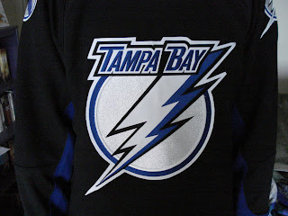
What kind of person would I be to spend months writing about the new Rbk EDGE jerseys and not purchase one myself? Well, in fact, I pre-ordered my new Tampa Bay Lightning jersey the very day they were unveiled. It was sitting in my mailbox when I got home this afternoon.

And here it is!


Let me just say that it is very nice.


It's just like all the pictures and things I've been recording all summer. Though to be fair, these pictures are my first real exclusive contribution to the blog. And here's a close-up of the new collar style.


It's so cool to finally own one. It's just a shame I probably won't make it to any games this season.

The only small thing that disappointed me a little about my replica is the shoulder logo. It's not embroidered, but is rather a faux leather-like piece that is stitched on. The good news is that nothing is ironed on.


Anyway, it's really cool and I'm wearing it to work tomorrow! Everyone should get a good laugh out of that.

UPDATE (2:25 PM): Some valid questions were asked in the comments regarding how my new jersey fits. So this picture to the left shows you.

I'm about 5'11" and pretty thin. I ordered a medium jersey and it fits perfectly, as you can see. I couldn't be more thrilled with that.

Like most people, I wasn't sure what size to order at first, but I figured I could exchange it if I absolutely had to. And medium seemed like a smart choice.

So there you go. Probably go with a large if you're taller or just like a jersey that's a little bigger.

Let me know if you guys have any other questions about it. Now that I own my own jersey, I can actually answer them.

Poll: Sharks Logo History


1991
2007


Place your vote and then feel free to leave a comment as to how you came to your decision. Tell all your friends to drop in and vote! The more voices heard, the more accurate the results!

Poll opening date
Sep 20 @ 4:30 AM
Poll closing date
Sep 27 @ 11:59 PM


07BONLH | LHSJS

Result: Capitals Logo History

BEST ALL-TIME
2007

46% 4,182 votes


9,015 total votes


1995
27% 2,415 votes


1974
17% 1,499 votes


2002
10% 919 votes


Poll opening date
Sep 12 @ 4:29 AM
Poll closing date
Sep 19 @ 11:59 PM


07BONLH | LHWSH