Saturday, October 20, 2007

Rbk EDGE Review: Stars

Part 27 of 30. All 30 NHL clubs have unveiled new jerseys under the new Rbk EDGE Uniform System for the 2007-08 season. Here at the NHLToL, we're going to review every one of them. Read up and then rate the new sweaters. We'll do a full ranking after completing all of the reviews.

Rbk EDGE Uniform System

Dallas Stars


New Uniforms

Old Uniforms

The Unveiling
Friday, September 14. The Stars unveiled their jerseys at a fan event in Dallas.

Home vs. Road
Home: Black. Road: White. The two sweaters are similar in striping pattern only, but are otherwise very different.

The black home jerseys feature two thin white-gold stripes with a wide gap between them around the elbows. The word "DALLAS" is white letters with gold trim is arched above the player's sweater number on the chest. The primary logo is featured as a shoulder patch. The collar is white with black trim on the inside.

The white road jerseys feature two thin green-gold stripes with a wide gap between them around the elbows. Gold-green trim wraps around the waist at the very bottom of the sweater. The secondary logo is featured as a shoulder patch. The collar is green with gold trim on the inside and the primary logo serves as the crest.

In The Details
The Stars are one of a handful of teams with crests differing between the home and road sweaters. They also join the Rangers as the only teams to have a jersey without a logo on the front. The same numbering and lettering style has been retained.

New & Old
The new uniforms have been designed completely different from the old ones. The star shape that spanned the entire sweater is now gone and there isn't even a logo on the dark jersey — which is now almost completely black instead of green.

Standard FAQ
Numbers on the front? Yes.
Laces at the collar? No.

NHLToL Editorial by Chris
First off, kudos to the Stars for trying something unique. The black jerseys look simply amazing. While I wouldn't want it to become a league-wide trend, the large number on the front gives the sweaters a great classic feel. However, I'm not as much a fan of the white jerseys. One thing this team missed the boat on was the striping. The stripes are way too thin and do not stand out like they should. To sum up, the minimalist design, I feel, works well on the black jerseys, but not so much on the whites. Still, I feel like it's overall a very nice uniform. 4/5


View the photo gallery

Buy your new Stars jersey!

Just To Freak You Out XI

Finally! I know I failed you guys yesterday in that Freak Out Friday never came to pass. But perhaps you'll allow me to get away with a Freak Out Saturday. The Everblades game aside, yesterday was a very busy day for me. Not to mention Blogger has been having issues with image uploading, an important piece of this puzzle. Anyway, here goes.

We'll kick things off with the team whose logo was named the champion here at NHLToL — the Montreal Canadiens. Some very strange artwork has made its way to my inbox — and now to your computer screen.


The concept on the left makes use of a little-known logo that the Habs wore back in 1910, prior to the formation of the NHL. As you can see it's on a Thrashers home jersey, which is weird, for more reasons than the light blue. The one on on the right is just as intriguing if not more so. It's a half maple leaf, half fleur-de-lis. And check out the Flames-influenced shoulder patches. The 100-year logo at the bottom is what puts it over the top. Well, then there's that logo of course. And the team name above it.

There just aren't any words for that. Nightmares.

Speaking of nightmares, the Nashville Predators have been trying to get more folks in the building this season so as to avoid something like this from happening.


Somebody really wants a hockey team in Hamilton? Raise your hand if you think that's going to happen. Now keep your hand up if you think they'd wear a jersey like this. Put your hand down. You're looking at a computer screen.

Before I leave Canada, I just got this one emailed to me today. It may be a little harsh that I'm sticking it in the Freak Out post, but it scares me just a little.


I realize I suggested attempting to work Alberta into the logo, but I'm not sure this is the winner. I do like the wordmark part (not as a primary!), but the province is weighing the whole thing down on the left side.

Wow I just had a weird visual. Imagine going on one of those insane diet pills. Maybe they get the formula wrong and you only lose weight on your right side. Sorry, just freaked myself out there. What's going on with me tonight?

Anyway, I know the new Washington Capitals secondary logo has been a big hit, but here's exactly how not to use it.


That's so bad I almost want to see what it would look like on a player. Damn.

Since we're on the subject of really bad, we'll top things off tonight with my team.


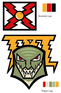
I was seriously considering posting this and trying to make you guys guess what team this logo concept was designed for, but I'm not sure you'd ever figure it out. I think the secondary logo is meant to resemble the state flag of Florida. Hmm. But as for the primary, I have no clue what's going on there. However, I have woken up in the middle of the night in a cold sweat with this as the last visual in my brain.

As we inch ever closer to Halloween, the freak-outs seem to be getting more freaky. Thanks to everyone who's sent in work!

And if you have any of your own or have spotted anything crazy out there on the web, feel free to email it to me at nhllogos@gmail.com and I may make it part of next week's Freak Out Friday. (And I plan to actually post it on Friday this time.)

Updates Imminent

Apologies for the lack of posts. This is getting pretty bad. Every time I try to upload photos, I'm getting an error message from Blogger, the service I use to maintain this blog. Obviously, the majority of the posts — especially the concept art — are reliant upon the image upload feature working. This is why we have nothing new today. And it's not just affecting me, by the way. But trust me, as soon as I can get images uploaded again, I will be all over it. Keep checking back. Thanks for understanding!

Poll: Hurricanes Franchise Logos


WHALERS
HURRICANES


Place your vote and then feel free to leave a comment as to how you came to your decision. Tell all your friends to drop in and vote! The more voices heard, the more accurate the results!

Poll opening date
Sat Oct 20 @ 9:40 AM
Poll closing date
Wed Oct 24 @ 11:59 PM


07BONRF | RFCAR

Result: Sabres vs Nordiques

Buffalo
SABRES

54% 1,261 votes


Quebec
NORDIQUES

46% 1,064 votes

2,325 total votes


Buffalo Sabres
Advancing to face Jets or Rockies


Quebec Nordiques
Eliminated


Poll opening date
Mon Oct 15 @ 12:33 PM
Poll closing date
Fri Oct 19 @ 11:59 PM


07VNTRN | #2A | BUF70vQUE

Blades Rough Up Sea Wolves

Not that you asked, but I enjoyed first regular season ECHL game tonight. I tried to get really into it, but the Everblades are just not my team. The Lightning will always be my team. But it was still a great game. The Blades tore through Mississippi with a 6-1 win.

I felt a little strange about it though, considering Sea Wolves goalie Morgan Cey is a Lightning prospect. He looked like crap, basically.

Anyway, I took a bunch of photos, so I'll run through a couple of them since you're here and reading this.


The Seminole Indian Tribe sponsored a bunch of blinking necklaces that were handed out as freebies when you walked in the door. It gave the arena a very interesting look during the the pre-game ceremonies.


The 2007-08 team was introduced to fans attending the opening night game. I don't really know any of them. Although I did meet captain Ernie Hartlieb and Steve Czech. They were interviewed on the television show that I work on.


Also, during the ceremony, the Everblades retired a couple of jersey numbers — the first in team history. All in all, these ceremonies honoring retired players and such lasted forever. The game was supposed to start at 7:30 PM. The puck didn't drop until after 8:30.


But when it did, it was fun to watch. I think I've been spoiled by the quality of NHL hockey in watching the Lightning over the last 15 years, but it was still entertaining hockey at Germain Arena, nonetheless.

I definitely plan on checking out more games as the season goes on. Well worth it, if you ask me. But I still miss going to Lightning games.