Monday, September 3, 2007

Prepping For Habs' Big Day

Along with the Calgary Flames, the Montreal Canadiens will be unveiling their new Rbk EDGE uniforms tomorrow. To get everyone ready for that, I have concepts.

Unlike the the Flames, the Habs haven't really leaked anything whatsoever regarding their new sweaters. I don't know of one solid rumor or suggestion thereof that we have to go on. It's going to be a total surprise. Or else, they won't change a thing and simply adapt the present design to the new cut and style like the Red Wings and Rangers have.


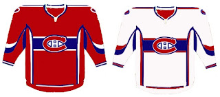
This concept is based off of the New York Islanders' new duds. They're pretty sharp and would probably go without too many complaints from Habs fans.

This fan-created design is closest to what the Canadiens wear as a road jersey at the moment. The white one above seems more like the vintage alternate jersey.

Not that there would be anything wrong with either. But I've been reading comments from Habs fans who would like to see a new road sweater more similar to that one.

If you're a fan who fears these uniforms will be too busy and feature an overabundance of striping, don't look now, but we have concepts to scare you.


Whoever wears those jerseys will need pretty big shoulders to fill them out. I'm not entirely convinced those aren't football jerseys. Anyway, I've also got a fan-created logo redesign to show off. What do you think?


Personally, I like it with the "H" in the middle and would hate to see it change. Furthermore, it won't change. The world will end before the Canadiens get a new logo, of this I'm quite certain. Perhaps it's my crystal ball or perhaps it's an understanding of human behavior and an overwhelming hatred of change in the hockey world.

Anyway, hope you've enjoyed what you've seen while you wait for the new sweaters to be unveiled tomorrow at some point. This goes for the Flames as well as the Habs, but naturally, as soon as I can post pictures, you know where to find them.

Prepping For Flames' Big Day

As you all know, the Calgary Flames unveil their new Rbk EDGE uniforms tomorrow. So to prepare, I've got concept art.

We'll start out with the most promising. From everything we've read and heard about the new jerseys, the following image most likely best represents what we'll see tomorrow.


Rumor has it that the Flames will be introducing a new shoulder patch, which may feature the Albertan coat of arms. Oilers fans, don't go getting your knickers in a knot just yet. Nothing's been confirmed. Wait one more day.

Overall those jerseys are pretty sharp. Here's hoping the Flames live up to that standard. For something a little different, check out these.


They're nice designs — if you can live with the numbers on the front — but feature the horse head secondary logo we've heard is going away. Personally, I always liked that logo. It made for one of the best third jerseys in the league, I thought.

Before I go, I've got one last concept to post that might make you rub your eyes or scratch your head.


I'll let you all find the words to describe that. Meanwhile, Flames fans, what are you hoping to see tomorrow when your team shows off their new threads?

What If The Jets Were Still Here?

Over the past week, I've been surprised at the number of concepts I've been sent featuring the Winnipeg Jets. Surprised because that team no longer exists. Still, all the work people put in made me think I should share some of what I received.

Here's what the Jets might look like in a new Rbk EDGE jersey. This concept is based off of the new Canucks jersey. Not bad at all.

But with all the modernizing of this league, I have a feeling the logo would be different today. The logo you see on this jersey has been around since 1990. Don't get me wrong, I think it's a great logo, but I just feel like it would've been changed somewhere along the way.

Maybe to something like this.


The diagonal stripe in the red jersey freaks me out a little bit. Too steep? The designer wanted me to let everyone know that the shoulder patch emanates from the city of Winnipeg's coat of arms. I know it's small, but it's there.

A different artists had a different idea for a new Jets logo and uniform set. It's also quite impressive.


I wish I could tell you it was an original design, but it's based entirely off of the AHL's Houston Aeros' logo. I do like the jerseys, though. Not too much to complain about there. A simple and classic sort of feel.

But despite all of this effort and toiling over Photoshop and Illustrator, the Winnipeg Jets moved to Phoenix in 1996 to become the Coyotes. So while I'm here, I also got emailed a great 'Yotes concept I can share.

One thing I don't like about the current Coyotes jerseys is the monochrome feel. Black is a big part of the logo so why doesn't it have any part of the uniform?


I like that a lot! Coyotes fans, do you have an opinion. Do you like these or are you more supportive of Wayne Gretzky's prescribed design which the team currently wears?

Poll: Canucks Logo History


1970
1978

1997
2007


We can't start Round Three of the tournament until Wednesday while we wait for the results of the Penguins/Canadiens match. In the meantime, we have logo history polls for those days off. Today, you can vote for the Canucks' best all-time logo. We're only comparing primary marks here. We'll get to other teams in the future. The Sabres are up tomorrow.

Place your vote and then feel free to leave a comment as to how you came to your decision. Tell all your friends to drop in and vote! The more voices heard, the more accurate the results!

Poll opening date
Sep 3 @ 4:18 AM
Poll closing date
Sep 10 @ 11:59 PM


07BONLH | LHVAN

Result: Hurricanes vs Devils

New Jersey
DEVILS

71% 8,633 votes


Carolina
HURRICANES

29% 3,593 votes


12,226 total votes


New Jersey Devils
Advancing to Quarterfinals to face Penguins or Canadiens


Carolina Hurricanes
Eliminated


Poll opening date
Aug 26 @ 7:05 AM
Poll closing date
Sep 2 @ 11:59 PM


07CHTRN | #E2A | CARvNJD