Monday, September 10, 2007

Flyers Push Up Jersey Unveiling

I just got an email from a reader pointing out that the Philadelphia Flyers have updated their web site with a new date for the unveiling event for their new Rbk EDGE uniforms. We will see the jerseys on Friday, September 14.


You'll see the date way down at the bottom of the screen shot. Apparently the AHL's Phantoms will also be unveiling their new sweaters at the same time. It's worth noting the link goes to the pre-order page and the image to the left of the text is last year's home sweater which is quite different from the new one.

We got a preview of it a week or so ago courtesy of season ticket holders. Thanks to Kara for the info on the new date!

I'll have photos posted as soon as I can on Friday.
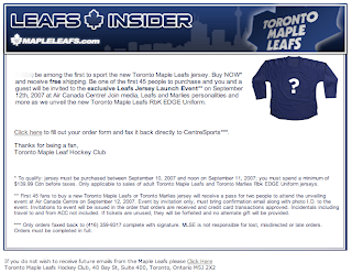
Leafs Insiders Learn Of Jersey Unveiling

Thought I'd point this out. Apparently, subscribers to the Leafs Insider received an email recently outlining information relating to the new Rbk EDGE uniforms being unveiled by the Toronto Maple Leafs. See the email below.


To sum up, the Leafs will be unveiling their new sweaters before a relatively small crowd (the email calls it an "exclusive" launch event) on Wednesday, September 12 at the Air Canada Centre.

I'll be keeping an eye out. And as you've come to expect, as soon as I can post photos I will.

Looking Ahead: Third Jersey Concepts

As we all know, the NHL is abandoning the third jersey program for this season. However, there are many indications that it will make a comeback as early as the 2008-09 season. Having said that, some people are getting a jump on things. Here I have a few alternate jersey concepts to share.

We'll start with the Washington Capitals. While the return to red, white and blue has grown on me, the wordmark logo has not. However, they've got a great shoulder logo that could use a little more mileage.


I especially like the idea of a blue jersey. Moreso than the red. Kudos to the designer on this one.

Keeping it in the Southeast Division, I've also been sent some Tampa Bay Lightning art.


Speaking as a Lightning fan, I do like the idea of a blue alternate jersey, but the logo needs the circle. What do you guys think of that? I think it looks even plainer without it.

Moving on to the Northwest, check out this rather colorful Edmonton Oilers rendering.


I like the gear logo better in silver. But that's just me. Let's finish up with a look at some Minnesota Wild concepts.


I remember back in 2000 when the Wild first unveiled their logo — the crest you see on these jerseys — and I was horribly afraid the jerseys might look like this. (I was thrilled by the bear head logo.) However, I kind of like the green as an alternate for some time in the future. Might be a little much though. Thoughts?

Poll: Blues vs Canucks


vs
St. Louis
BLUES
Vancouver
CANUCKS


Place your vote and then feel free to leave a comment as to how you came to your decision. Tell all your friends to drop in and vote! The more voices heard, the more accurate the results!

Poll opening date
Sep 10 @ 4:10 AM
Poll closing date
Sep 17 @ 11:59 PM


07CHTRN | #W3B | STLvVAN

Result: Red Wings vs Canucks

Vancouver
CANUCKS

55% 13,311 votes


Detroit
RED WINGS

45% 10,946 votes


24,257 total votes


Vancouver Canucks
Advancing to face St. Louis Blues


Detroit Red Wings
Eliminated


Poll opening date
Sep 2 @ 7:45 AM
Poll closing date
Sep 9 @ 11:59 PM


07CHTRN | #W2D | DETvVAN