Sunday, August 5, 2007
An Abundance Of Islanders Art
Every so often I find myself with just so many images for one team I feel like getting them all posted in one shot. Today that team is the New York Islanders. Remember that Atlanta Thrashers artwork I posted on Friday? Well, I've got more from that same artist (who's apparently been posting his awesome work over at the SportsLogos.net message board.
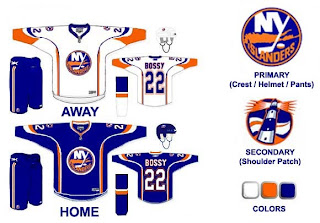
If you ask me, that's a pretty nice set of logos. Isles fans? This is the uniform set that goes with those logos and they're just as cool. I really like the lighthouse as a primary element. I don't think you can lose the "NY" altogether because that's just one of those things that's always been there and it really does look good.
The Islanders tried out a lighthouse logo back in the mid-'90s when they switched to the fisherman logo. But nobody liked the fisherman, so they reverted back. I don't know why they didn't keep some version of the lighthouse, though.
In fact, this next design makes use of that lighthouse. Before you look, though, just know that it is a design based off the dreaded all-star jersey template.
I like that its a Mike Bossy jersey. Good stuff. The only problem is, those logos don't really go well together. The waviness of this lighthouse logo just went better with those mid-'90s jerseys. I'm curious to know what Islanders fans thought of those — and this jersey design. Though I think the designer is trying to subliminally mess with your sense of nostalgia by placing Bossy's name on the back. I'm just about done here. This is another example of a lighthouse-based logo. It doesn't necessarily have to be the primary mark, but I think it would make a good secondary logo. Put it on the shoulder patch or something. This one isn't extremely well-balanced for a sports logo, but I had it so I thought I'd post it.
One last thing and then I'll leave you and the Islanders alone for a while. Sorry I don't have a larger size, but a reader emailed this logo to me. It's got some neat elements but I'm not sure what it would be for. Perhaps a seal logo for hats and t-shirts and the like.
To sum up, it's a lot of cool fan artwork and absolutely nothing official from the team. Sorry to disappoint, but nobody has been saying anything official these days and I still want to keep posting new stuff on the blog. So the only way is to post fan designs in the interim while we wait. As always, I'll be sure to let you know when something official is announced. Until then, enjoy the fan artwork, and feel free to submit any of your own.
Posted by
Chris
at
12:42 PM
8
comments
![]()
Tags: concept designs, fan art, islanders, jerseys, new logos, news, rebranding
New Stuff For Ducks, Canucks
Got some fun stuff for your Sunday. The first is a jersey design for the Anaheim Ducks that playfully (and pitifully) attempts to look like a "leak." Thought it was funny.
The designer himself said it's a manipulation of the old Nashville road jersey. As far as the webbed duck foot "D" logo, I'm really hoping its what Anaheim goes with this season. I've heard that they will be dropping the wordmark on the uniforms, but we have yet to see anything official from them. Anyway, enjoy this and try not to take it seriously. It's not the real thing.
Looks like another fan came up with this concept for a new Vancouver Canucks uniform.
It seems to borrow from the newly unveiled Florida jerseys. It's not a well-balanced logo, but what do you Canucks fans think? Would you like to see something like this? Or do you prefer the orca logo, which we're hearing will stay on the new Rbk EDGE jerseys (in new colors)?
And for everybody else, what do you think about all this stuff? Don't be fooled. None of it is actual team artwork — just fan-created fun. But do you think it's good work? Or should it have stayed in the minds of these fans and off this site? Be gentle.
Posted by
Chris
at
11:57 AM
7
comments
![]()
Tags: canucks, concept designs, ducks, fan art, jerseys, news
Canadiens vs Sabres
 |  | |
The Aesthetics
The blue abounds. This competition isn't based on tradition (or else most teams wouldn't even get a fair shot) so don't think I'm picking the Canadiens logo just because it's been around as long as dirt. It's got good, strong colors and is very clearly defined. Often people have a hard time discerning what the Sabres logo is as the creature appears to have no legs. Let's move on.
Canadiens
The Nickname
Unless the Canadien was a strong swordsman, a Sabre would likely end him.
Sabres
The Analysis
Once again the Sabres lose the point because the actual team name seems to have been more of an afterthought in designing this logo. Yes, it's supposed to be a buffalo but I'm not buying the blue sabre across its back. The Canadiens have a solid image which has withstood the test of time. I don't want to get into the whole "H" debate again, though, so I'll just leave that be and say that's why the Canadiens logo earns this point.
Canadiens
 |
Stars vs Oilers
 |  | |
The Aesthetics
All right, so both of these logos feature the team name as a main element, I'm sorry to say. The Oilers name appears to take up more of the logo than anything else but the the Stars logo also has the city name on it. Which is worse? A single drop of oil is meant to graphically symbolize the Oilers so we'll go with the Stars logo since it at least has a giant star on it.
Stars
The Nickname
Remember that giant ball of fire. Imagine a Star coming in contact with an oil pit. All of the Oilers would be toast. Or, incinerated, rather.
Stars
The Analysis
I thought the Stars logo looked great on all the Stanley Cup champion merchandise back in 1999. It's been a while since we've seen the Oilers logo on that stuff. All right, cheap shot. I apologize. I think despite its tradition, the Oilers might be better served by something like the logo they've been wearing on their third jersey. That was very sharp. The Stars should never ever reconsider their third jersey logo. I recently read where someone called it a "mooterus" which had me laughing out loud for a moment. Sweep for the Stars.
Stars
 |
Red Wings vs Predators
 |  | |
The Aesthetics
Neither of these logos are very simple in design but they're complete opposites in color. The Red Wings logo is rather monochrome while the Predators logo just goes nuts with color. Ultimately, that will give the Preds the edge here.
Predators
The Nickname
I'd imagine any Red-Winged bird would be smart enough to fly up high so as to avoid the Predators on the ground.
Red Wings
The Analysis
Even though I think the Red Wings logo could use some upgrades (think Boston Bruins), it is still very effective and one of the most well-known in all of sports. That has to earn it some credit, right? The reason I'm giving in this point, though, is because it takes that extra step in referencing their home city with the wheel (you know, Motor City) while the Predators does not. And so ends the tournament for the Wings.
Red Wings
 |
Senators vs Panthers
 |  | |
The Aesthetics
There's a lot of detail in each logo but it doesn't really get bogged down in it. But still, that panther is scary. We're anticipating a logo change for the Senators, but could it really be better than the Panthers?
Panthers
The Nickname
It's a Senator who sits in his government office making laws to protect animals such as the Panther. He, therefore, has the upper hand in this relationship.
Senators
The Analysis
These two teams have nicknames that are associated with their city, so a logo that references it specifically is doing double duty. The Florida panther is from Florida. Ottawa is the capital oif Canada where government representatives get together. But in the Senators logo, you could say there's a gold "O" for Ottawa and a red "C" for Canada. Or at least that's what I'm telling people. And the Panthers are done for this tournament.
Senators
 |


