Concepts In Photos
It's my favorite thing. Concept renderings in pseudo-photographic form.
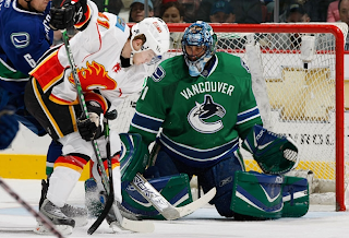
The most commonly used player for these jersey redesigns has overwhelmingly been Roberto Luongo. And it hasn't just been Canucks concepts for him, either. But tonight, yes, they are both Canucks concepts. Here's one.
Seriously, I would buy that. That green looks phenomenal. I don't know why his teammate isn't also wearing green over there on the left, but that team would still look a million times better if only Luongo wore a good sweater. While I'm thinking of it, are there still people left who liked the old '80s logo and colors?
Don't be fooled, though. It's not the jersey. Luongo can make anything look good.
Next we're moving on to the Philadelphia Flyers.

It's a simple redesign that incorporates orange and a bit of silver. But if you want to see the goalie wearing it, well you'll have to look at the image on the right (not the left).
Back to the days of black-and-white Kings here.
And hurricane flags that are actually hurricane flags.
Now we see why the team didn't do that in the first place. The shoulder thing is cool because it incorporates both of the Carolina-named states. I don't think a dividing line at the border would be too much to ask for clarification's sake.
Lastly, if you hated those mustard-colored jerseys once worn on special nights by the Nashville Predators, then you're absolutely going to adore this.
And one final note (which may or may not explain the late hour of this particular post) if you are into things that are funny but not necessarily hockey-related. First, go see Juno. Great film. (In one scene there's a guy wearing a Minnesota Wild jersey. The green one you all like.) And buy a copy of Stephen Colbert's "I Am America (And So Can You!)". (I'm pretty sure he's all about the OHL's Saginaw Spirit.) These two things will complete your life. If they don't, you have no soul.


