Saturday, December 8, 2007

Poll: Senators vs Hurricanes


vs
Ottawa
SENATORS
Carolina
HURRICANES


Place your vote and then feel free to leave a comment as to how you came to your decision. Tell all your friends to drop in and vote! The more voices heard, the more accurate the results!

Poll opening date
Sat Dec 8
Poll closing date
Wed Dec 12


07SCTRN | #1A | OTTvCAR

Rebranding The Devils

Continuing his rebranding of the NHL, our friend Matt has taken a shot at the look of the New Jersey Devils. He emailed me these images to share with the rest of you.


If you want my opinion, the logos look fantastic, but I think the current primary works too well to throw out altogether. So my suggestion (which I feel like I've made before) would be to swap the primary and secondary marks. I think the secondary here is a great update of the classic Devils logo. I'm also a fan of the wordmark.


These jerseys are another great update, but I couldn't be more impressed by the alternate uniform. That one really grabbed me first. While overall not as impressive as some of his previous work, these are some very sharp designs.

By the way, Matt went ahead and painted his home jersey onto Martin Brodeur. And while I normally wouldn't post a photo of Brodeur on my blog without a puck in the goal net behind him, I'll make an exception here.


Like I said, great logo, but it seems like it belongs more to a minor league team on the front of the jersey. Those black jerseys are my favorite.

By the way, Matt wanted me to let everyone know that if you'd like to contact him directly about his work, feel free to email him at gfb_designs@yahoo.com. Otherwise, leave your comments below for all of us to read.

UPDATE (6:34 PM): Hey guys, due to popular demand, I'm introducing a small new feature. You can now access all of the rebranding concepts by Matt (aka GhettoFarmBoy) by clicking on the link under NHLToL Series in the sidebar. Or by clicking here. I'm considering creating an album solely for his work in the Concepts Gallery.

Just To Freak You Out XVIII

It's time for another belated edition of the Freak Out series. Hopefully I'll get over this cold soon. It's making me very unreliable here at NHLToL. And it's supposed to be Freak Out Friday, right? Anyway, let's dive in.


Wow, that was awfully violent. Who's hungry for buffalo tongue?!

I got a ton of submissions this week for the "If They Mated" category. And these are all about rivalries.


I don't even know what to say about this. Except that once again, don't send me hate mail as I am excessively illiterate and wouldn't understand it anyway. Also I didn't make these.

Perhaps slightly less inflammatory are these.


Everything's gone haywire. But wait it gets better. Sure anyone can mix two teams in a blender, but it takes a special kind of talent to do three.


Presenting the Anaheim King Sharks. Let me break it down for you. You've got the Sharks logo in Kings colors on a Ducks jersey. Can't get much more to the point than that.

While we're still on the topic of ridiculous jerseys, do you remember the crazy Red Wings design I posted a while back. (It's the second one down in that post.) Were you wondering what it might look like on Dominik Hasek? Wonder no more.


Don't know what he's so happy about. Hideous if I do say so.

Here's a scary merging of the current and original Canucks logos.


Whales that play hockey. I love it.

To finish up this morning's post, I've got a couple more whacked out logos. I'm pretty sure these come from a Quebecois looking to break away from Canada. It's like if Texas decided it wanted to be its own country. I laugh. But then I am a lousy Floridian who knows nothing of the politics of Canada. Look!


But wait, there's more!


So what do you guys think?

Oh and I'm just warning you now that any comments with discussion of politics will be promptly removed. Go elsewhere for that.

In the meantime, I hope I managed to freak you out a little. Until next time.

Friday, December 7, 2007

Poll: Blue Jackets vs Panthers


vs
Columbus
BLUE JACKETS
Florida
PANTHERS


Place your vote and then feel free to leave a comment as to how you came to your decision. Tell all your friends to drop in and vote! The more voices heard, the more accurate the results!

Poll opening date
Fri Dec 7
Poll closing date
Tue Dec 11


07SCTRN | #0B | CBJvFLA

Thursday, December 6, 2007

Poll: Sabres vs Avalanche


vs
Buffalo
SABRES
Colorado
AVALANCHE


Here we go. It's the start of yet another logo tournament at NHLToL. Time for you guys to decide which team has the best secondary logo. We'll kick things off with a two-part preliminary round, starting with the Sabres and Avalanche.

Place your vote and then feel free to leave a comment as to how you came to your decision. Tell all your friends to drop in and vote! The more voices heard, the more accurate the results!

Poll opening date
Thu Dec 6
Poll closing date
Mon Dec 10


07SCTRN | #0A | BUFvCOL

The Award-Winning NHLToL!

Hey all! Just wanted to brag a little. NHLToL has been named an award-winner!

Joe Pelletier's Greatest Hockey Legends blog named its Top 3 blogs in six categories. NHLToL was No. 1 for Best Continuing Coverage Award. I guess Joe was impressed with my coverage of the unveilings of the new Rbk EDGE jerseys over the summer.

Anyway, I just thought that was kind of cool and wanted to share with everyone. Thanks to Joe and everyone else for reading the blog!

Legal Advice

I'm sure you're all looking forward to the Secondary Logo Tournament later today, but first I wanted to see if I could get a little help from the best readers in the blog universe.

I'm looking for some advice from a copyright lawyer or a lawyer who is familiar with copyright law. I had an idea for a really cool project that I'd like to look into but I want to first be sure I won't run into any copyright issues. It doesn't deal with this blog directly, but it is somewhat related.

I'd like to tell you guys about it because it will involve a lot of you and I think you'll really like it. I hate to be such a tease, but I want to make sure I've got all my ducks in a row first.

So, once again, I'm looking for a little advice from a copyright lawyer or someone very familiar with copyright and fair use law. Let me know if you or someone you know can help. I'd be forever indebted. Thanks!

Secondary Logo Tournament

For the first time in months, actually went an entire day without a single post. Sorry about that everyone, but I've been a little under the weather lately.

So to make it up to you, I'm kicking off the Secondary Logo Tournament today. Look for the first poll and the new bracket to be posted later this afternoon. In fact, you can get a sneak preview of that bracket right here.


As always, here's a brief explanation of the new bracket. The 18 logos being used in this tournament are the secondary logos featured on the shoulders of each team's uniform. If you have any questions about the logos featured, please don't hesitate to ask. Logos were placed in the bracket at random (thanks to Random.org). As you can see from the bracket, we'll begin with a preliminary round then move on from there.

As a side note, you'll notice that despite my request for a more accurate version of the Chicago Blackhawks logo (and thanks to all of you who responded), I never came across anything that was quite right. So I opted to go with the version that is used on team merchandise. I figure it's close enough and I really want to get this tournament started.

Hope you guys enjoy the tournament!

Tuesday, December 4, 2007

Talking Teal

Tonight's post is all about the San Jose Sharks. No reason in particular. We'll start out with one of my favorite new concept designs. Remember this? And remember how I said that black jersey was my favorite?


It looks even more spectacular on the ice. Seriously, who disagrees? Is that not what a hockey jersey is meant to look like?

I probably should've finished with that image because what could possibly follow it? These two are just designs I thought had interesting aspects to them — not the least of which being the crazy logo on the right which almost won it a spot in Friday's Freak Out post.


The white sweater is a recoloring of the Lightning's road jersey with an odd addition to the shoulders.


This set is really nice because of the striping. Yet for some reason, it makes me think of a spider more than a shark. Still, I do like it.

Lastly, there's this one which only warrants posting for its comical shark's-tooth zig zags around the waist.


Please don't eat me.

Monday, December 3, 2007

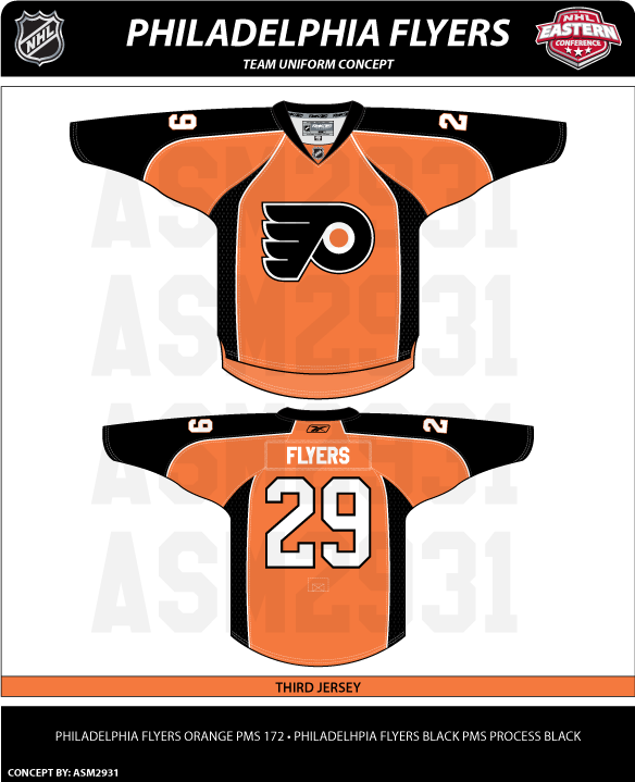
Philly Concept Designs

In going through hordes of concept art I have on my computer at the moment, it occurred to me that I have a ton of Philadelphia Flyers stuff. So I thought I'd dump it all here in one shot — while at the same time noting that the team itself seems to be back from the dumpster it had been rotting in all of last season.

I really don't know where to begin. But I figure you can't go wrong with a concept jersey that has blood on it.


What ever happened to colored nameplates? Sure they look horrible, but it always makes me think of the 1980 Olympic team. Love that collar blood.


This one is pretty sharp. Nice mix of black and orange. However, it's a design that makes me question how its white counterpart would be colored. Or is this a better third jersey? We all know how Flyers fans love their orange jerseys.

While we're on the topic, the striping pattern on this concept is similar to the uniform of more recent years.


While I like the black home jersey, I tend to lean more toward the orange because the logo stands out more. A primarily black logo on a black jersey just hides things.


Here's another orange one with the third jersey logo. Not sure how I feel about the numbering and lettering. Might look awkward with the silver outline.

Speaking of awkward, here's how you don't design a jersey.


It's like Ron couldn't decide which side of the fence to sit on? Orange or black? Instead, he's just got a fence post up his ass.


And this last concept is kind of cool except for the fact that it looks like a hooded sweatshirt to me. I'm not sure why, that's just all I see when I look at it.

Hope everyone enjoyed their Flyers fix for the day. I'll be back tomorrow with more. And yes, I am working on the next logo tournament. These things take time and I'm a busy television director in real life. (Ignore my nonsensical ramblings.) Patience.