Philly Concept Designs
In going through hordes of concept art I have on my computer at the moment, it occurred to me that I have a ton of Philadelphia Flyers stuff. So I thought I'd dump it all here in one shot — while at the same time noting that the team itself seems to be back from the dumpster it had been rotting in all of last season.
I really don't know where to begin. But I figure you can't go wrong with a concept jersey that has blood on it.
What ever happened to colored nameplates? Sure they look horrible, but it always makes me think of the 1980 Olympic team. Love that collar blood.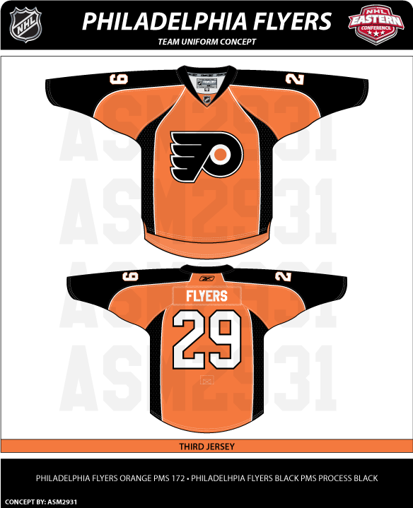
This one is pretty sharp. Nice mix of black and orange. However, it's a design that makes me question how its white counterpart would be colored. Or is this a better third jersey? We all know how Flyers fans love their orange jerseys.
While we're on the topic, the striping pattern on this concept is similar to the uniform of more recent years.
While I like the black home jersey, I tend to lean more toward the orange because the logo stands out more. A primarily black logo on a black jersey just hides things.
Here's another orange one with the third jersey logo. Not sure how I feel about the numbering and lettering. Might look awkward with the silver outline.
Speaking of awkward, here's how you don't design a jersey.
It's like Ron couldn't decide which side of the fence to sit on? Orange or black? Instead, he's just got a fence post up his ass.
And this last concept is kind of cool except for the fact that it looks like a hooded sweatshirt to me. I'm not sure why, that's just all I see when I look at it.
Hope everyone enjoyed their Flyers fix for the day. I'll be back tomorrow with more. And yes, I am working on the next logo tournament. These things take time and I'm a busy television director in real life. (Ignore my nonsensical ramblings.) Patience.
![]()


11 comments:
Your a TV director? Of what?
Philly jerseys...meh. When are you going to post those Devils mockups?
not a big fan of those concepts.
like the first one.
it's a lot like their jerseys from the mid 70's.
don't like the two colour name on the off colour name bar, think names would look better just white (or even black).
that first one looks like it has a subtle change in the logo. the streaks coming off the P look sharper. the current ones look like fingers, but this ever-so-slight update actually makes the logo look a little more sleek.
or maybe i'm imagining things :-)
Doesn't the Edge wick away blood?
I really like all of them except for the "Ron" jersey. It's a horrible mix. I agree with greyraven8, the one jersey does look a lot like their jerseys from the 70's, very sharp. As a Flyers fan, any of these would be better than their current jerseys, in my opinion. Hopefully, one day they'll switch to the bottom design. That would look good.
It's the Flyers... the blood is from the opponent who was checked illegally.
haha drew i was about to say that!!
Your a TV director? Of what?
News. Nothing too exciting.
Thanks for the comments, everyone!
Great minds (of Hurricanes fans) think alike, Michaela!
The Ron jersey is almost exactly like a joke uniform I drew in high school almost 20 years ago. The only difference is that in my drawing, I had a number on the front shoulder (part of the joke, since I hate them), and Captains and Alternates wore capes...
Post a Comment