Rebranding The Panthers
We've seen some great work from this guy in the past. He's redesigned images for the Ottawa Senators and Boston Bruins as well as the New York Islanders, Atlanta Thrashers, and Anaheim Ducks.
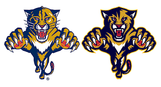
GhettoFarmBoy has now posted his Florida Panthers redesign. In this instance, however, his concept isn't so much a complete overhaul, as a rethinking of that which we already know.
He simply reworked the current primary logo a bit. Sharp work if not familiar. He basically simplified it in areas and added more curved lines to replace straight ones.
He kept the secondary logo, essentially, the way it was. Overall, though, the biggest issue I had with the logo was that the panther itself seemed a little cross-eyed compared with the old one. Others on the SportsLogos.net message board felt the same, so he reworked the eyes a bit.
A great improvement. The new eyes make the animal feel more cat-like. The jersey designs are also pretty nice. Again, they still feel more familiar to me than anything else. Certainly an improvement, but not to the point that they're downright amazing the way his earlier Ducks redesign was.
I commend the work being done by this artist though. I think he has a real talent and it's a shame the NHL doesn't hire peole like him to handle uniform and logo designs. I think it would be a much better looking league if they did.
I should also point out that he's said his next "rebranding" will be the San Jose Sharks and that we should expect the New Jersey Devils soon as well.
Personally, I'm pulling for the Lightning, just to see what he comes up with.
Now the floor's open to you all. What do you guys think of this work?


13 comments:
Dear NHL,
Fire Reebok and hire this guy. Immediately.
Very, very sharp stuff.
GHETTOFARMBOY has all the right ideas. Excelent graphic design artist. Should definately consider his work in the future. His Anaheim Ducks concept is gret. Personally I would like to see what ideas he has for the Rangers considering they cant seem to decide on anything...im only guessing.
Brillant stuff!
I want to see a Hurricanes redesign!
oh my gosh, this guy has a gift... love what he's doing, but please leave the panthers alone, as nice as this is, i LOVE the panthers logo and jerseys, even with the half stripe on the elbow everybody seems to hate...
I wounder what program he uses to make these designs?
Maybe GHETTOFARMBOY should reveal his true identity and help a design firm desperate for superior work clean shop and hire him!
It's is getting ridiculous to see regular people trump professional designers in certain circumstances.
Love it. Love them all. Only question is, why doesn't he have the third jersey with the Panther breaking the stick in half? I love that logo, but all in all I love it.
Although they'll never change their design - and good on them for it - I'm kinda curious to see what this guy's creative juices could provide for the Red Wings. I'd never want the logo or design to change in a million years but some kind of secondary/shoulder patch logo ideas could be interesting.
He's using Adobe Illustrator Trevor. I'm a graphic artist myself. Nice work GhettoFarmBoy, I like the FP logo you created.
PLEASE PLEASE PLEASE PLEASE PLEASE do something with the sabres!!!!!
Really awesome work!
GFB, can we talk you into doing the 'Jackets?
As I said on the sportslogos.net message board, this guy's work is outstanding and I agree with Drew that this designer should be hired to re-redesign the NHL uniforms. I don't agree with changing the classic look for the Islanders (even though they did), GhettoFarmBoy has done some other great concepts. Awesome job on the Panthers! I hope one day his here are implemented!
The Panthers logo makes the panther look like he's got an emo haircut. Not so good.
Post a Comment