Just To Freak You Out VII
I've decided to make the Freak Out series into a weekly feature to be posted on Fridays from now on as long as crazy artwork keeps landing in my inbox. And man, do I have some stuff for you this week.
We'll begin with our friend Pfizer who's created mish-mash logos for the likes of the Vancouver Canucks, Buffalo Sabres and New York Islanders (check out the Freak Out series for those if you haven't yet). Now comes another shot at logo merging for the Los Angeles Kings.
For my money, it's not his best effort, but it makes me laugh no less. I'm a little disappointed he couldn't find a way to work in the current crown logo. But then it does feel a little thrown together. You have to admit, though, that king face is a great logo. Don't mess with that son of a bitch.
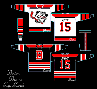
Meanwhile, I've got some completely new takes on a couple of team logos and uniforms. Imagine the Boston Bruins swapping out the yellow for red. Then imagine a cartoon bruin the likes of which might be owed money by Yogi Bear.
He's come to collect. Then imagine the Colorado Avalanche adopting a yeti for their primary mark. Might it frighteningly go a little something like this?
We should hope not. Lest ye bear the brunt of the abominable snowman's ever-clenched fist. And what's up with the upside-down feet on the shoulders?
Speaking of what-ifs, let's say the Kansas City Scouts were to make their glorious return to the NHL. Let's also say their return was marked by the uprooting of the Pittsburgh Penguins. Yes, this design was made in the days when the Pens' future was uncertain. I point that out merely to explain its color usage.
If you enlarge the image, you can read the designer's explanations of the three logos, so I'll spare you the details here. What I will say is that I like Patch 2. I'm a big fan of city skylines in logos, though you don't see that a whole lot. What's cool about this one is the new Sprint Center being placed to look like a puck. Clever.
The horse's eyes are freaking me out, by the way.
This next image is probably best viewed while high. I don't condone drug use, but chances of one having an "experience" are rather great. See for yourself.
Someone with a good deal of free time and an inability (or not) to cure boredom came up with this. He basically recolored the Montreal Canadiens' logo in the colors of various teams around the league. Conspicuous is the absence of the Tampa Bay Lightning's colors. But I guess not everything is about the Lightning.
Now I want to show you some of the scariest things of all — because they're real! Okay zombies aren't real, but movies are real. A reader emailed me a production still from the new Resident Evil movie. One of the zombies appears to be wearing an old Nashville Predators sweater.
Talk about foreshadowing. That's not even right.
And finally, a reason for all those NHL fans out there bemoaning the arrival of the new Rbk EDGE jerseys to quiet themselves. It could have been so much worse. A fact proven by the AHL's Philadelphia Phantoms.
AHL fans, continue your bemoaning. It's perfectly warranted.
Freak.
Out.


9 comments:
Those Scouts ideas actually look pretty badass.
How many God Damn logos does RBK need to put on a jersey?!?!?!?!?!?!?!? Look at the top and bottom of the Phantoms' jersey!!!!!!!
AAAAAARRRRRRRRRRGGGGGGGGHHHHHHHHHHH!!!!!!!!!!!!!!!!!!!
Someone needs to stop RBK!!!!!!!! They are so out of control!
yeah, the primary scouts logo is kickass
Kindred, you have no idea. Teams might have had "final say" on their uniforms, but believe me when I tell you that Reebok has more control than you think.
I'm amazed that the teams that changed little to none were even allowed to do so. If you watched the Chicago unveiling video, it was stated that they "fought very hard" to keep their traditional uniform.
Why should they have to "fight" at all? Shouldn't it be as simple as telling them "keep it the same?"
Sadly, my Sabres weren't so lucky.
the kings logo is too funny hahaha
The Bruins "Yogi Bear" is actually the logo for the Penrith Bears, a team in the Australian Ice Hockey League.
Go the Dogs!!
owensjb is right, both the bruins and avalanche are both Australian Ice Hockey League...i played there last year...the bruins actually won the cup a few weeks back...the pennireth bears and adileade avalance...sorry for the spelling...im horrile with aussie city names!
Anyone ripping on the Phantoms' jersey can go to hell. Yeah, the multicolor thing on the back is screwed up, but the rest of the jersey is fine. Not as good as their old ones, but definitely not the worst ones produced. Besides, what happened to "being original"?
I'll the Phantoms' new jerseys over the Flyers' new threads any day.
Robert, Rob, Bob, Bobby -
I'm a Flyers and a Phantoms fan and I love the new Flyers threads. I also loved the new Phantoms jerseys the first time I saw them, but once I saw what they did to the back of those jerseys, I nearly vomitted. C'mon, Bob, Rbk should be ashamed of themselves for designing such crap. The Phantoms just went from having one of the best logos and jerseys in the AHL to this crap.
As for the Scouts logo - while I don't know that KC will ever get an NHL team and if they do, I hope they go with a different name than the Scouts, I really like the Primary logo. Great design work and the glowing eye makes it even better.
Post a Comment