Dipping Into The Oil
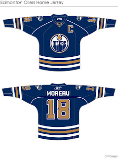
More concepts! These fan-designed works of art were created for the Edmonton Oilers.
 These concepts were created by the same artist who brought us the Chicago Blackhawks jerseys I posted earlier today.
They're very clean designs and would make great uniforms for the Oilers. I especially like the use of the shoulder patch from the third jersey on this set. I don't think it should necessarily replace the crest, but I do like it a lot. I could definitely see them going with something like this.
But I'm not an Oiler fan so it's not really my place to say.
If you're not a fan of the copper, you might enjoy this.
I'm not sure the secondary logo would work at the wrist — being hidden by the gloves. The curvy stripes up the sides are reminscent of the Buffalo Sabres' current sweaters, but not all bad. You could do a lot worse.
I've got one final design for you that eliminates both the copper and red, replacing it with the silver from last year's third jerseys.
I think that's a little too plain. Oiler fans, what really matters is your opinion. See anything you like here? Or does the Oil need an extreme makeover?


12 comments:
As an Oil fan fan, and just as a person with (debateably) good taste...I don't like any of what I see here. Fuck change.
I like the first set of jerseys. I wouldn't mind seeing them. I would like to see the logo from last years alternate jersey on the shoulder though.
That first jersey is pretty good, I would not mind seeing that 41 times a season. Just need to see a white jersey.
lol oops sorry he did make them, I like the white ones to.
The last one is missing color. The 2nd last one could be ok if it weren't for some poor design flaws. The first set is good, but I've seen some other jerseys, particularly ones that throwback to the retro jerseys with orange that are suprisingly good.
ya fuck change... tradition
they better keep them about the same. Screw all these high tech looks. Simple!
The first one is pretty fashionable. As for tradition, seeing more of that Blue and Orange would be cool too. Whatever comes out, I'd be satisfied with it. I'm sure it won't be as tacky as the Vancouver one :P
by blue and orange, I meant the old school jerseys back in the 90s :)
they arent bad; but they arent fantastic; i'd like to see more use of the marvel logo than these shoulder patches. If you take a close look at the site; the only thing they seem to be certain of is that there will be a copper oildrop - so who knows where thatll lead.
As an Oilers fan, i definately like the first set best. Bringing back the orange wouldn't be so bad either. As long as they don't do anything stupid like the Canuckleheads.
The first set is good, just drop the piping around the shoulders/upper back and it's perfect.
Post a Comment