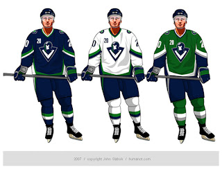
Canucks Jersey Concept Designs
Last week, I posted some fan-made designs for the Vancouver Canucks' new logo and uniforms. We've heard that they're going to be unveiling a new logo this summer so everyone's wondering how it will look. So here are some more.

These way-too-cool designs come from John Slabyk, he of Blue & Gold Project fame. He's a graphic designer who was implored by fans to take his artwork to Larry Quinn with the Buffalo Sabres. They liked his work a lot but a meeting with the team's GM yielded nothing. Not to be discouraged, he has come up with a potential new design for the Vancouver Canucks.
And this is it. It's really cool but it's probably a little too high-quality for the NHL. The design is really clean and even incorporates the classic stick-in-rink logo of the 1970s while sticking with those traditional colors. So far, responses I've read to the design are mixed, though. I think the gist is that a lot of people like it but aren't naïve enough to think the design would actually ever been worn by the team.
Personally, I'm not giving up hope on the Canucks or the NHL. Anything is possible and one day soon I hope to see them donning a logo that doesn't feature a whale more prominently than, well, a Canuck.


4 comments:
This would be the coolest logo in the NHL.
The designer put a blog on the Canucks site where he said he researched Johnny Canuck to be a WWII ace pilot - not a lumberjack.
He's Canada'a Captain America, so to speak.
You're right though, this logo will never see the light of day, and I hope what has been leaked of the new orca logo colour changes are completely not true.
i am a huge fan of the orca logo and it is my favorite logo/jersey in the league. i am sad to see it go but I LOVE THIS LOGO/JERSEY CONCEPT!!!
Very cool concept! I thank the designer for taking the time to put this together. The attention to detail and club history is amazing! It has Johnny Canuck, the "V" from the early '80s worked into the pilot's neck, the stick-in-rink logo in the goggles, and if you look really closely there's the eye from the whale logo worked into the side of the pilot's helmet (not sure this was totally intended as it is a mirror image of the eye). The only thing missing would be the skate logo of the '80s/early '90s.....but that's being picky. VERY SHARP LOOKING!!!
OH PLEASE LET'S HAVE THIS ONE!!!!
Post a Comment