Just To Freak You Out XXIV
Can you believe yet another Friday is already upon us? I've had a long day (which began with me waking up at 1 AM) so forgive me if I make this a quick one. Just trying to freak you out a little.
Last week's theme was crazy logos. This week's theme is crazy jerseys. For instance, what if when the Quebec Nordiques moved to Denver, they opted not to change their name or logo — just their colors?
Yep, that would've happened. Good guess.
I think this next one was submitted as a Dallas Stars concept, but I don't really get it. 
Are all Texans also banditos? On second thought, don't answer that.
This next one is a little disturbing.
Blood in the water.
I posted a concept Lightning logo a couple weeks ago. Here are the jerseys that go with it. 

I'm still not a fan.
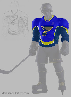
Giant hockey player... smash!
And what sort of person would I be if I didn't work in some Vancouver Canucks art? (Yes, arguably the most well-represented club on this blog much to the dismay of a handful of you.)
The weird thing is I sort of like the whales. Here's what I really don't like.
And finally, I've got this logo that serves as a great followup to last week's insane logo fusions.
There's why the Chicago Blackhawks and Detroit Red Wings will never merge. The logo just wouldn't work as you can plainly see.
So it turns out this post was a little longer than I planned. I impress myself. By the way, at some point this weekend I hope to update the Concepts Gallery as I have over 100 images waiting to be added. I'll let you know when I get it done.
Hope you enjoyed the 24th Freak Out post. See you again right here next week!


11 comments:
looks like the canucks just won the gold medal for figure skating
That Dallas "Banditos" concept isn't as weird as you think. The Dallas team in Arena Football is the Dallas Desparados, and that's there logo except there is supposed to be a star behind the cowboy.
The Colours on the Avalanche Coloured Nordiques Logo are All Wrong, The silver and blue should be switched.
A Red Sharks Jersey...Looks Nice, Just not for a team like the sharks.
The Canucks...The Flying-V Seriously Doesn't Work Well. The Logo with the orca whale would look quite good as a Secondary Logo Though, Maybe Replace the gold in the background of it though.
That's the first thing I thought as well, awildermode. Well, I didn't have figure skating in mind, but a medal for sure. Either that or some crazy rapper bling.
That Blues jersey was painted onto an Upper Deck All-Star Vinyl figure. I'm not sure if I like or hate them.
The banditos comment really cracked me up. wow. Those Lightning jerseys make me wanna vomit though. Yuck!
The Banditos logo is actually a logo used in EA Sports NHL Video game series when creating your own team. Check it out!
Oh yeah sorry it isn't the desparados logo, there is a few differences.
@ andy and kyle,
sorry dudes, hate to burst your bubbles but the logo is from the dallas desperados of the arena football league.
http://sportslogos.net/logo.php?id=5565
There is something weirdly cool about that Blackhawks/Wings mashup. Then again, I've always been a huge fan of the Red Wings' logo. I also like the jumping Orcas in that secondary Canucks concept.. they're a tad less aggro than the Orca in their current primary logo (which is a good thing)
I'm still waiting for my Canucks concept to be posted. Way better than the two here, IMNSHO.
i gotta no how u do it
Post a Comment