Concepts In Photos
It's my favorite thing. Concept renderings in pseudo-photographic form.
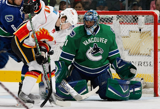
The most commonly used player for these jersey redesigns has overwhelmingly been Roberto Luongo. And it hasn't just been Canucks concepts for him, either. But tonight, yes, they are both Canucks concepts. Here's one.
Seriously, I would buy that. That green looks phenomenal. I don't know why his teammate isn't also wearing green over there on the left, but that team would still look a million times better if only Luongo wore a good sweater. While I'm thinking of it, are there still people left who liked the old '80s logo and colors?
Don't be fooled, though. It's not the jersey. Luongo can make anything look good.
Next we're moving on to the Philadelphia Flyers.

It's a simple redesign that incorporates orange and a bit of silver. But if you want to see the goalie wearing it, well you'll have to look at the image on the right (not the left).
Back to the days of black-and-white Kings here.
And hurricane flags that are actually hurricane flags.
Now we see why the team didn't do that in the first place. The shoulder thing is cool because it incorporates both of the Carolina-named states. I don't think a dividing line at the border would be too much to ask for clarification's sake.
Lastly, if you hated those mustard-colored jerseys once worn on special nights by the Nashville Predators, then you're absolutely going to adore this.
And one final note (which may or may not explain the late hour of this particular post) if you are into things that are funny but not necessarily hockey-related. First, go see Juno. Great film. (In one scene there's a guy wearing a Minnesota Wild jersey. The green one you all like.) And buy a copy of Stephen Colbert's "I Am America (And So Can You!)". (I'm pretty sure he's all about the OHL's Saginaw Spirit.) These two things will complete your life. If they don't, you have no soul.


15 comments:
I love the kings' concept. They should definitely go back with the black and silver color scheme.
You know. It was said on the radio the other day that the NHL is trying to attract children now. Since the ratings aren't doing too hot, team offices are marketing stuff for kids. Look at how "minor-league" or, how i like to put it, "cartoony". Look at the Buffaslug. Sure, us older people don't appreciate it, because we have our history with the Sabres. However, kids would probably find that mess amusing. Also, new logos that look more appealing to kids are the Lightning Logo (sorry Chris), the new Sens logo, and the new Sharks logo. I would almost see Pittsburgh's going back to their original logo as for the youth watching the NHL, not that other ugly mess. I don't know, but I'd like to see some people's views on this.
i'd like to be the first canucks fan to point out that the "teammate" that isn't wearing the same jersey as louie is Sami Salo
anyway that green canucks jersey is really awful if you ask me
i might boycott the team if they wore green jerseys
Well, sabres persuasion have a good point. But I can't imagine a large conspiracy among teams about looking cartoony for the kids. Teams have a lot to say in their marketing.
And we all know they can also make mistakes.
Unfortunately, Sephiroth, since this is a sports league, you have to look at the possibility of conspiracy. Not only that, it's too good of an idea by the NHL to begin with. Think about it. Make the players look animated (not the actual players, but you know what I'm saying), the kids like them, the kids think they look awesome, the kids start to watch hockey, ratings for the NHL go back up for nationally televised games, and finally, the NHL becomes just as popular as the other major sports. No longer would it be looked at as a minor league.
luongo isnt that good. hes just a big freak of nature goalies. gone are the days of small goalies with actual skill (hasek..belfor...um...roy?). now its a bunch of glandular freaks minding the nets. doesnt help that the pads are freakin ginormous. wanna increase scoring? bigger nets my ass, how about smalled pads? well thats my rant.
Haha I just saw Juno tonight also. Absolutely agree, one of the best movies I've ever seen. And that Wild jersey most definitely caught my interest.
After seeing the movie get the soundtrack. It's stellar.
Wasn't the NHL considering having the goalies wear different coloured jerseys, like they do in soccer?
...and just for the record, that LA jersey (without the purple) looks fantastic.
Love the LA Kings black/silver jersey. Wow!
Canucks. Skate jersey. MAKE IT SO
I've never been big on Vancouver's logo, but you can't argue with their colours. Adding a green jersey like that one would be great. Whoever did the photoshopping did a great job, as well. Most of the photoshops look really good, even if I don't like some of the jersey designs.
i saw juno, great movie.. but i saw no wild jersey.. what scene?
I know I shouldn't even respond but darryl, how can you honestly say Luongo is just a big goalie that doesn't have "actual skill"? Watch him play, his positioning is phenomenal, he has a great glove hand and he barely lets out big rebounds. A big goalie is Alex Auld, he's good but alot has to do with his size
1) Kings jersey is cool.
2) I think the whole point of not having a dividing line for the carolina shoulder patches is to treat it as a single place, as their name suggested. It's the "Carolina" Hurricanes, not "north & south carolina hurricanes. So the patches have carolina. it makes sense to me
Post a Comment