Dropping Into Carolina
Today's concept art subject is the Carolina Hurricanes. Got a lot to share so I'll get started right away.
First up, a simplification of the current uniforms.
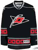
It basically drops some striping. Not much to speak of. There's also an idea for a black third jersey using the current primary logo.
I like the triangular shoulder designs. However, a lot of the rumors we've heard suggest that the secondary logo will don the chest of a new alternate sweater.

The one on the right is funny because of the waves. Reminds me of the Lightning's sole attempt at a third jersey in the mid-'90s.
But as many have pointed out, that flag is actually a tropical storm flag. It's simpler and therefore makes a more balanced logo. Technically, a hurricane flag would look like this.

What do you think of that secondary logo?
Now we'll go back in time a little to when the 'Canes were the Hartford Whalers. We've got some Rbk EDGE designs for them.
That's nice but I don't think the folks from Hartford will be able to identify well with the hurricane flags around the bottom.
Probably a better design there. I like that green jersey a lot. Thoughts on these? Post a comment.


11 comments:
If the last 'Canes concept was black, it would be a great third jersey for Carolina next season. I really think both those logos would work.
That third concept on the left is perfect. Hopefully it looks similar to that.
I do like that Concept but the jersey definately needs some more white and red, because there is just to much black.
Also, the organization intentionally didnt put 2 flags on the logo because they thought it would take up to much space and look awkward.
The third concept on the left is mine. (Chris cropped my name and website again.) I find that dark jerseys often look better if you cut down on the white, but maybe it's a matter of taste.
See more 3rd jersey concepts at wererevolting.com.
The third concept on the left is mine. (Chris cropped my name and website again.) I find that dark jerseys often look better if you cut down on the white, but maybe it's a matter of taste.
Apologies for that, Jacob. I often crop images to make them fit better within the post. Try to fit your credits/links within the area I crop to in the future.
Looks better with one flag than with two, even if it's not entirely accurate.
Jacob, I love the Hurricanes jersey(the flags on the arms!), But i agree with Jrod too, more Red is needed so i came up with this...
http://img262.imageshack.us/
img262/5842/hurricanesconceptac7.png
Mainly because i am not a fan of the useless shoulder pinstripe, and I think you have to have different coloured shoulders if you are going to have the stripe.
The NHL really needs a team with primarily green home jerseys. The Whalers jerseys look really sharp
Hey Bill, I really like that Jersey, it's kind of a mix between Ottawa's old third jersey with the arrows on the body and arms, and the 'canes current jersey. It definately looks better with the athletic stripe filled in.
The sad thing is that the third with the waves is still better than the one Tampa actually used!
Post a Comment