Concept Art Grab Bag
I don't really have a theme for tonight's concepts post. Mainly, I just thought these were different and interesting. Kind of curious to see what sort of feedback they get.
One of my favorite things is seeing really nice concepts painted onto game action photos. So I'll start with those. There's this one Kings design from a while back that I liked a lot. 
I think it's kind of funny that Roberto Luongo is wearing it. I guess L.A. fans can dream, right?
There was also a bit of Canadiens artwork that I made part of a Freak Out post that a lot of people responded rather well too. Here you can see what it looks like on Cristobal Huet.
I wonder why both designers decided to paint fake jerseys onto goalies. Hmm.
Anyway here are a few more wacky designs that don't quite warrant being included in the Freak Out series.

For those who don't care for the sky blue, how about maroon? Doesn't look terrible either. I'm sure the asymmetry is still driving you nuts though. And how about the Ducks' logo and colors on a Sabres jersey? That's pretty weird.

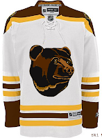
I thought the colors were interesting on the Bruins jersey. That logo really did wear out its welcome, though, didn't it? And for a complete change of pace, I've got a Flyers jersey with a redesigned set of logos.
And to finish things off, as far as ironies go, I thought this was a pretty good one.
The Columbus Blue Jackets wearing red sweaters. Don't get me wrong. I think it's a really nice-looking jersey, but blue is in their name. It's one of those no-brainers.
Anyway, let me know what you guys think of those. I'll try to have more posted tomorrow.


11 comments:
I really like the Atlanta jersey... Take note Thrashers! throw in another stripe on the other side and we're good. Even without the other stripe, I like the loss of the baby-blue and the addition of maroon. If you want a baby-blue jersey, well I personally thing the Pens could use it. I love that old jersey for the outdoor game!
Thanks to that Philly logo, I will now be calling them the Foo Flyers for the rest of the season. Which I don't like, because I'm from Boston and the Foo's are my favorite band.
Wow, those Bluejackets jerseys are nice. I've always thought their star logo was pretty stupid. But ya, you'd have to go with the blue one.
The Ducks jersey is a big step up. Almost anything would be. And I also prefer the Thrashers in maroon, but I think it's the armpit-to-hip stripes on that jersey that always bugged me.
Maroon looks really good with the Thrashers colours. Not sure about it as a jersey, but working that colour into their design somehow might not be a bad idea.
The Bruins jersey isn't bad at all. A different bear might be better, but the idea with the old colours is good.
That flyers logo is from the fort worth flyers of the NBADL.
Oh, and as for why they use goalies to paint their designs onto, I'm guessing it's because goalie try to be big and square to the puck all the time, which keeps the front of the jersey open and easier to get their logo onto. Skaters always have their arms in the way, so that would be trickier, I'd imagine.
Yes, the asymmetry is still driving me completely bonkers!
Is it just me or does Atlanta suite bergundy! It goes great with their logo. If they had a stripe or two on the bottom, the have a great uni.
By the way, whats up with the two pucks on the L.A. concept? Take a look.
The two pucks are probably because the shot was taken during pre-game warmup or something when the players are rapid-firing pucks at the goalie. It would also explain how the photographer was able to get such a head-on action shot.
The Bruins shirt with the bear head is really cute. But cute is not what you looking for in an hockey Logo. Third shirt maybe but definitely not primary.
Burgundy sooth the Trashers really well too.
Post a Comment