Monday, December 3, 2007

Philly Concept Designs

In going through hordes of concept art I have on my computer at the moment, it occurred to me that I have a ton of Philadelphia Flyers stuff. So I thought I'd dump it all here in one shot — while at the same time noting that the team itself seems to be back from the dumpster it had been rotting in all of last season.

I really don't know where to begin. But I figure you can't go wrong with a concept jersey that has blood on it.


What ever happened to colored nameplates? Sure they look horrible, but it always makes me think of the 1980 Olympic team. Love that collar blood.
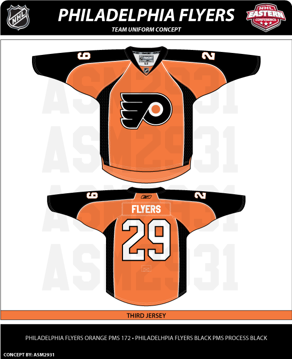


This one is pretty sharp. Nice mix of black and orange. However, it's a design that makes me question how its white counterpart would be colored. Or is this a better third jersey? We all know how Flyers fans love their orange jerseys.

While we're on the topic, the striping pattern on this concept is similar to the uniform of more recent years.


While I like the black home jersey, I tend to lean more toward the orange because the logo stands out more. A primarily black logo on a black jersey just hides things.


Here's another orange one with the third jersey logo. Not sure how I feel about the numbering and lettering. Might look awkward with the silver outline.

Speaking of awkward, here's how you don't design a jersey.


It's like Ron couldn't decide which side of the fence to sit on? Orange or black? Instead, he's just got a fence post up his ass.


And this last concept is kind of cool except for the fact that it looks like a hooded sweatshirt to me. I'm not sure why, that's just all I see when I look at it.

Hope everyone enjoyed their Flyers fix for the day. I'll be back tomorrow with more. And yes, I am working on the next logo tournament. These things take time and I'm a busy television director in real life. (Ignore my nonsensical ramblings.) Patience.

Sunday, December 2, 2007

Just To Freak You Out XVII

Welcome to the belated 17th installment of the Freak Out series. Time's been getting away from me the last few days so I apologize for the delay. Anyway, this week's art has a very specific theme. I asked for you guys to send me stuff of the "If They Mated" variety and some of you actually responded.

We'll start with a couple of logos I thought were "special."


If you're staring at that and just can't place it, look no further than the Ottawa Senators. You'll recognize his cap from the Columbus Blue Jackets' shoulder patch. That one just cracks me up every time I look at it. It's like the guy took the day off to go to a baseball game but he still can't seem to wipe that constipated look off his face.

The next one goes out to all my Connecticut readers.


It's a combination of the Hartford Whalers and Hartford Wolf Pack. And the more astute among you might notice the nod to the New England Whalers. That's three leagues covered in one logo. Impressive.

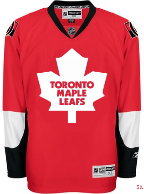
So going back to Ontario now, try to imagine what would happen if the Leafs and Sens (perish the very thought) were to swap uniforms and colors?


Don't send me hate mail. I'm illiterate anyway.

And now for a rivalry absolutely no one could care less about.


Personally, I'm disgusted by this but it does make me laugh a little. What's with the black tongue on the panther? Someone should tell him to stop chewing on his pen.


This here is more of a fusion of past Coyotes jerseys. We've got the old colors on the new uniform. How many of you like me would prefer to gouge out your own eyes before watching a team wear a jersey with two different color shoulder yokes? That's got to be breaking some sort of law.

Speaking of law-breaking, remember the scary Blackhawks logo I used to kick off last week's Freak Out post?


Somebody glued it on a jersey. D'oh!

And then I thought this was mildly amusing if nothing else.


But this is what happens when you guys stop sending in the really good stuff. Hope you enjoyed another week's worth of Freak Out art. Hopefully I'll be back with more on Friday. Enjoy what's left of your weekend!

Result: Rangers vs Oilers


OILERS NAMED CHAMPION!


Congratulations go out to the Edmonton Oilers' third jersey logo this morning for being named by the voters here at NHLToL as the best! The Oilers finished the final poll with a 55% of the more than 2,700 votes.

Over 30,000 votes were cast in this tournament on the way to determining the champion. So as always, my biggest thanks go out to everyone who cast a vote. You guys are the reason I bother. Oilers fans, enjoy your bragging rights!

But it's not over. We'll be determining the best secondary logo in the NHL next. So stay tuned for that. I should have a bracket and first-round schedule posted soon.

Saturday, December 1, 2007

Devils Sneak Peek

I almost went all day without a new post, didn't I? My apologies for that. I was out of town all day and therefore away from my computer. I've been driving for most of the night so I don't have the wherewithal to write a lot right now. What I can offer is a sneak peek at Matt's rebranding of the New Jersey Devils. He emailed me a simple square to share with you all.


Apparently that's all we get for now. Expect to see his full designs some time soon.

Friday, November 30, 2007

Rebranding The Capitals

I got an email yesterday from the graphic artist we know as GhettoFarmBoy, responsible for the San Jose Sharks redesign I recently posted. His real name is Matt, by the way, and he's got a new rebranding concept that's been out for a little while. As I mentioned in that Sharks post, he said his next venture would be the Washington Capitals.

Prepare yourself.


The primary logo is awesome, but my favorite is the secondary. That is the best logo representation of the Capitol dome that I have ever seen. There's just so much about that logo that's right on the money. He just keeps outdoing himself, doesn't he?

And I couldn't be a bigger fan of the jerseys.


One of my favorite things is the gold accent color in the logo. But at the same time I think it's right that only red, white and blue were used in the uniforms. It's knowing when to stop that can make or break a design. I'll continue to say that any team would be lucky to wear a uniform or logo that looked this good.

And by the way, since it was brought up a while back, yes I would put these designs right on par with the likes of the Blues and Canadiens. Talk about making hockey look good.

I'm continually impressed. As it happens, Matt has informed me that his next project is the New Jersey Devils. He says he's nearly finished so I'm looking forward to being able to post that here very soon. I thought I'd finish off this post with something he wrote in his email to me.

I want to thank you for posting my concepts on your site. I sincerely appreciate all of your hard work putting together the site/blog. It's been a great resource for me and I will continue to visit it.

I'm so glad people are enjoying my concepts. As a young graphic designer (I just turned 18 a few months ago) it means so much that my designs are appreciated. I have never taken any design clases or anything of the sort, so when I hear a compliment like "fire reebok and hire this guy" it makes my day....

Freak Out Delay

It's Friday so I know you guys are expecting the Freak Out post. Just to let you know, I've decided to hold out a day on that. You should expect to see some pretty wild concept art here at some point on Saturday. My apologies for the delay. In the meantime, feel free to revisit some of the previous 16 installments of the Freak Out series. Enjoy!

Thursday, November 29, 2007

More Fancy Concept Jerseys

Do you guys remember the incredibly sharp concept art I posted back on Saturday? If not, I just linked to it, so go look at it. Anyway, a guy named Pete designed the jerseys and basically, he's got a lot more where that came from.

For example, you're about to see an Edmonton Oilers concept that I think rivals the Anaheim Ducks artwork created by GhettoFarmBoy. It's that good. Just look.


I like the idea of reworking the Oilers logo to have an oil drop in the proper color. Oil is black, not copper. However, I don't know how I feel about the copper circle. Might take a little getting used to. But my personal favorite is the copper "2nd alternate" jersey. I'm also a huge fan of that alternate logo. And if you were wondering what such a jersey might look like on a player, well look no further.


I would almost buy that if I were the kind of person who could buy a jersey that had anything but a Lightning logo on it. I like that uniform a lot. Can you tell?

Anyway, Pete also did a little work on the Philadelphia Flyers. The striping pattern is unique — and not in a bad way.


And finally, this isn't entirely the work of Pete. In Saturday's post, you saw his Rangers jersey with the words NEW YORK spelled out across the front instead of RANGERS. I suggested that the jersey might be improved with the Lady Liberty logo. So a couple of you made some modifications.


I think I was right. (Modesty is rarely my strong suit.) Thoughts?

Feel free to comment below. I'm sure Pete would like the feedback on his work — which is obviously rather excellent.

Wednesday, November 28, 2007

If They Were Still Around Today

In today's concepts post, we'll be getting all nostalgic for the old teams that doesn't exist anymore. The fun part is we're going to take a glimpse at what some of those classic clubs might have looked like if they'd made it into the Rbk EDGE era. Just to make things easy, we'll go geographically from east to west.

Kicking things off in Hartford, how about a Whalers logo that covers the entire jersey?


The sweater on the right features the Atlanta Flames logo in a design borrowed from the Chicago Blackhawks. If that's not classic enough for you, remember the old Cleveland Barons? Here's what they might look like if they had hurricane flags wrapping around the waist.


And next to that is a Kansas City Scouts design sans the yellow in the flavor of the Phoenix Coyotes. Speaking of the Coyotes, enjoy this irony.


The Winnipeg Jets logo you see on these jerseys is a concept design that I posted a while back here on the blog. As you can see, these jerseys borrow from the New York Rangers and, ironically, the Coyotes. And we'll finish our trip westward in Colorado. Here's what the Rockies might've looked like in a uniform modeled after that of the Buffalo Sabres.


Don't forget that if you have any concept art you'd like to share with the folks here at NHLToL, you can always email me at nhllogos@gmail.com.

Tuesday, November 27, 2007

Poll: Rangers vs Oilers


vs
New York
RANGERS
Edmonton
OILERS


This is it for the Third Jersey Logo Tournament. The final round of voting. Time to determine a champion. Place your vote and then feel free to leave a comment as to how you came to your decision. Tell all your friends to drop in and vote! The more voices heard, the more accurate the results!

Poll opening date
Tue Nov 27
Poll closing date
Sat Dec 1


07TJTRN | #4A | NYRvEDM

Monday, November 26, 2007

Help Wanted: Blackhawks Logo

Hi everyone. I've hit a wall and I could really use your help finding a decent quality version of a surprisingly hard-to-find logo. The Chicago Blackhawks wear on their shoulders a logo that depicts two tomahawks crossed over a letter "C."

Actually, it looks a little something like this.


The actual logo is close to this but not quite the same. If you're as anal as I am and look really closely, you'll notice the differences I'm talking about.


Notice the serif on the "C" as well as ties on the tomahawk heads and the overall proportions of the two logos. I know the differences are so incredibly minor that it almost doesn't matter. But quality and accuracy matter to me so just indulge me a little if you will.

Stare at those two logos a while and see if you can help. My goal is to have the proper logo for the secondary logo tournament which I'm anticipating will be the next in the series here at NHLToL. Thanks in advance for all your help!