Saturday, September 29, 2007

Rbk EDGE Review: Predators

Part 6 of 30. All 30 NHL clubs have unveiled new jerseys under the new Rbk EDGE Uniform System for the 2007-08 season. Here at the NHLToL, we're going to review every one of them. Read up and then rate the new sweaters. We'll do a full ranking after completing all of the reviews.

Rbk EDGE Uniform System

Nashville Predators


New Uniforms

Old Uniforms

The Unveiling
Thursday, July 19. The Predators unveiled their jerseys at a fan event at Sommet Center in Nashville.

Home vs. Road
Home: Blue. Road: White. The two sweaters are essentially mirror images of each other but for minor alterations in terms of overall design and both feature secondary logo patches on each shoulder.

The blue home jerseys feature yellow piping extending down from the collar. The side panels are white. A thick stripe of silver outlined in blue extends from the neck to the cuff on the sleeves which are otherwise blue from the shoulder to the elbow and white to the cuff with blue piping around the wrist. The collar is blue and yellow and the primary logo serves as the crest.

The white road jerseys feature blue piping extending down from the collar. The side panels are blue. A thick stripe of silver outlined in blue extends from the neck to the cuff on the sleeves which are otherwise white with blue piping around the wrist. The collar is blue and yellow and the primary logo on a blue triangle serves as the crest with the word "NASHVILLE" just above it.

In The Details
The same shoulder patches featuring the secondary logo are found on both shoulders of each sweater. The white sweaters feature the city name above the logo, slightly differentiating it from the blue sweaters. The same numbering and lettering style has been retained.

New & Old
There are several differences in the overall design of the new sweaters when compared to the old. The silver shoulder yoke now extends completely down the arm. It also had yellow piping and a much thicker blue stripe around it that curved down to the wrist. The stripe and elements around the waist are also gone but replaced by side paneling. The new white sweaters do not include as much blue as the old ones did. On the ice, the jerseys look relatively similar, but you can find differences if you're really looking.

Standard FAQ
Numbers on the front? No.
Laces at the collar? No.

NHLToL Editorial by Chris
I've always been a fan of the Predators' jerseys. The old white is one of two non-Lightning jerseys that I actually own. (The other being a 1996 Mighty Ducks third jersey so that may not be a good barometer.) Looking at the home sweater on a rack, it can make you think of a t-shirt, the way the blue extends only down to the elbow. But I think that just adds to its uniqueness while many find that it's a fault. Another thing a lot of folks aren't fond of is the city name above the logo on the road sweater. That's one element I'm on the fence about. I see the merits of it while at the same time am bothered by it as a design element. On top of that, seeing these jerseys on a rack versus in action are two very different animals. I really don't care for how the whites look on the ice. I am impressed with the blues though. I'll call it a wash. 3/5
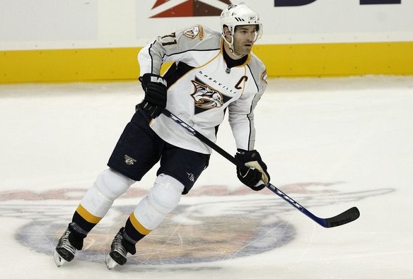
View the photo gallery

Buy your new Predators jersey!

Possible Secondary Logo Tournament

You've still got 4 days left to vote, but I thought I'd show you what a Secondary Logo Tournament would look like. Apologies for the delay but for some reason I thought I'd already posted it.

Last weekend I posted the possible Third Jersey Logo Tournament which was in the lead at the time. Then I posted the possible Vintage Logo Tournament which has now slightly overtaken the former for the lead.

The secondary logos are behind in the voting, which doesn't mean we'll never do it — just that it probably won't be the next one. But regardless, here are the 18 that would be used if it were next.


That's a very colorful group. The bracket would be determined randomly but wouldn't be posted until the tournament begins.

I'm a little concerned, however, that the Chicago Blackhawks secondary mark I have is a little off. Comparing it to photos, the "C" and the black stroke aren't quite right.

If any of you have the logo that appears on the Hawks' shoulders or know where I could find it, please let me know. I want everything to be as accurate as possible with this. You can leave a comment or email me.

One last thing. A couple of people have mentioned doing a concept logo tournament, throwing a bunch of the concept logos we've seen into the pool. I'm trying to gauge interest on that. Would you guys want to vote on that at some point in the near future or do you think it would be a waste of time? Drop me a line, either way.

Capitals, Here's How You Fix It

The sixth entry in the Here's How You Fix It series will take a look at the Washington Capitals' new duds.

One of seven teams to introduce new or updated logos, the Caps we the route of the old days by creating a wordmark logo that harkens back to the 1970s and the arrival of the team on the NHL scene. Now it may just be a personal complaint I'm voicing, but I don't really understand the striping patterns on the new sweaters. They just do something strange along the arms and sides if you ask me.


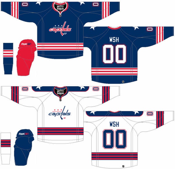
So in the interest of considering a more traditional — heaven forbid — striping pattern, I thought I'd post this concept which was emailed to me by a reader.


The striping is simple and I love the stars on the shoulders. I also like the Capitals in blue as opposed to red or black — like the had been wearing. Another neat aspect of this concept is that the colors of the logo are swapped for the home and road jerseys. Little things like that are what make me like a uniform.

How do you feel about it? Leave your comments below.

Coming up: San Jose Sharks.

Mailbag: New Canucks Logo Looks Familiar

This morning I woke up to find one of the funniest emails I've received since starting this blog.

To set things up for you, one of the sites I frequent is Chris Creamers SportsLogos.net. It's an excellent resource for a blog like mine. When the Vancouver Canucks unveiled their new uniforms last month, a bunch of alternate/secondary logos appeared on that site — none of which I saw in any official NHL/Canucks capacity, however.

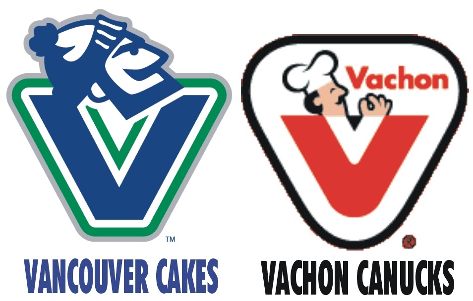
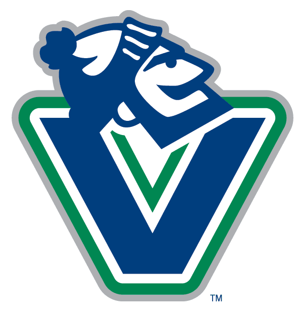
Anyway, among them was a logo that I personally thought could serve amazing well as a primary mark for the club. This is it.


Now the email.

Hey Chris!

Is that really an official secondary logo? If so, I've attached this! You may find it funny!

In Canada, we have these things that are like Hostess Cakes in the States.... Vachon Cakes! They're very popular.... and tasty! And I've heard that ol' goalie Rogie Vachon is a close relative to the family that started the company!

I knew I had seen the Vancouver 'Johnny Canuck' logo somewhere before..... hmmmm! I mean, mmmmmm!


So what do you make of that? I just thought it was very funny and felt it was worth sharing.

Rangers Sue NHL

We finally have an answer to the reason for the delay in the New York Rangers adapting their web site to the new NHL.com format. According to CBC Sports, MSG has sued the NHL claiming violated antitrust laws by monopolizing control of team promotions.

The AP report can be found at CBC Sports' web site and below.

September 28, 2007

Rangers' owner claims NHL acting like 'illegal cartel'

The Associated Press

The NHL violated antitrust laws and is acting like "an illegal cartel" by monopolizing control of team promotions, Madison Square Garden claimed in a lawsuit Friday.

MSG, which owns the New York Rangers, said it filed the suit in U.S. District Court in Manhattan because the NHL would begin fining the organization $100,000 US per day starting Friday if the company did not give the league complete control over the Rangers' website and other promotions.

The league is seeking to control the licensing of teams for all commercial purposes and to stop teams from marketing apparel, merchandise and memorabilia, the suit said. MSG asked that a judge order the league to stop limiting team promotions, and it also wants the court to clarify the boundaries of the league's rights.

The company said the NHL had once worked with teams in a legitimate joint venture, but had more recently "veered into unlawful behaviour."

"By seeking to control the competitive activities of independent businesses in ways that are not necessary to the functioning of that legitimate joint venture, the NHL has become an illegal cartel," the suit said.

Scott Arthur Eggers, a lawyer for the NHL, said he had no comment.

The lawsuit said the NHL insisted last week that MSG transfer control over the Rangers independently produced website, including the "nyrangers.com" address so that the league could convert it into one of 30 "cookie-cutter" club websites at "nhl.com."

The lawsuit said MSG had spent years developing the site to market Rangers hockey in competition with other NHL teams. By seizing the site, the NHL would eliminate competition between teams and harm consumers.

"The NHL has no competitive justification for seizing the Rangers website, which MSG today uses as a competitive tool to generate and maintain fan interest in the Rangers in competition with other NHL teams," MSG said.

At the start of the playoffs last spring, MSG said it increased its competitive offerings by making Rangers-branded merchandise available through the Rangers website rather than a catalog, and by making Rangers games available to subscribers on its website.

The NHL forced MSG to withdraw the efforts when it imposed a penalty of $100,000 per day, MSG said. When the company refused to pay the fines, the league withheld $200,000 from third-party payments otherwise due MSG, the lawsuit said.

MSG gave in to the league's demands because it did not want to detract from the playoffs, and it hoped that it could negotiate a solution to NHL actions it thought were unwise and illegal, it said. "That hope was in vain," the lawsuit said.


For the record, the Rangers' web site is currently in the new format. I'll be keeping an eye on how this plays out.

Poll: Ducks Logo History


1993
2006


Since the Ducks and Kings are kicking off the new season in London this weekend, I'm opening logo history polls for Anaheim today and Los Angeles tomorrow. Man, I wish I was back in London right now.

Place your vote and then feel free to leave a comment as to how you came to your decision. Tell all your friends to drop in and vote! The more voices heard, the more accurate the results!

Poll opening date
Sep 29 @ 10:40 AM
Poll closing date
Oct 6 @ 11:59 PM


07BONLH | LHANA

Result: Blue Jackets Logo History

BEST ALL-TIME
2007

78% 3,317 votes


4,256 total votes


2000
28% 939 votes


Poll opening date
Sep 21 @ 4:35 AM
Poll closing date
Sep 28 @ 11:59 PM


07BONLH | LHCBJ