Eastern Identities
Just when you thought things couldn't get better, what with the Wallpaper Wednesdays kicking off today, I have concept logos. And some really great ones too. And since we did the West yesterday, today we're sticking to the East. Dare I say it, some of them even rise to level of Matt's work.
We're starting with the New York Rangers. And before you balk at the notion of rebranding a member of the Original Six, just give it a chance.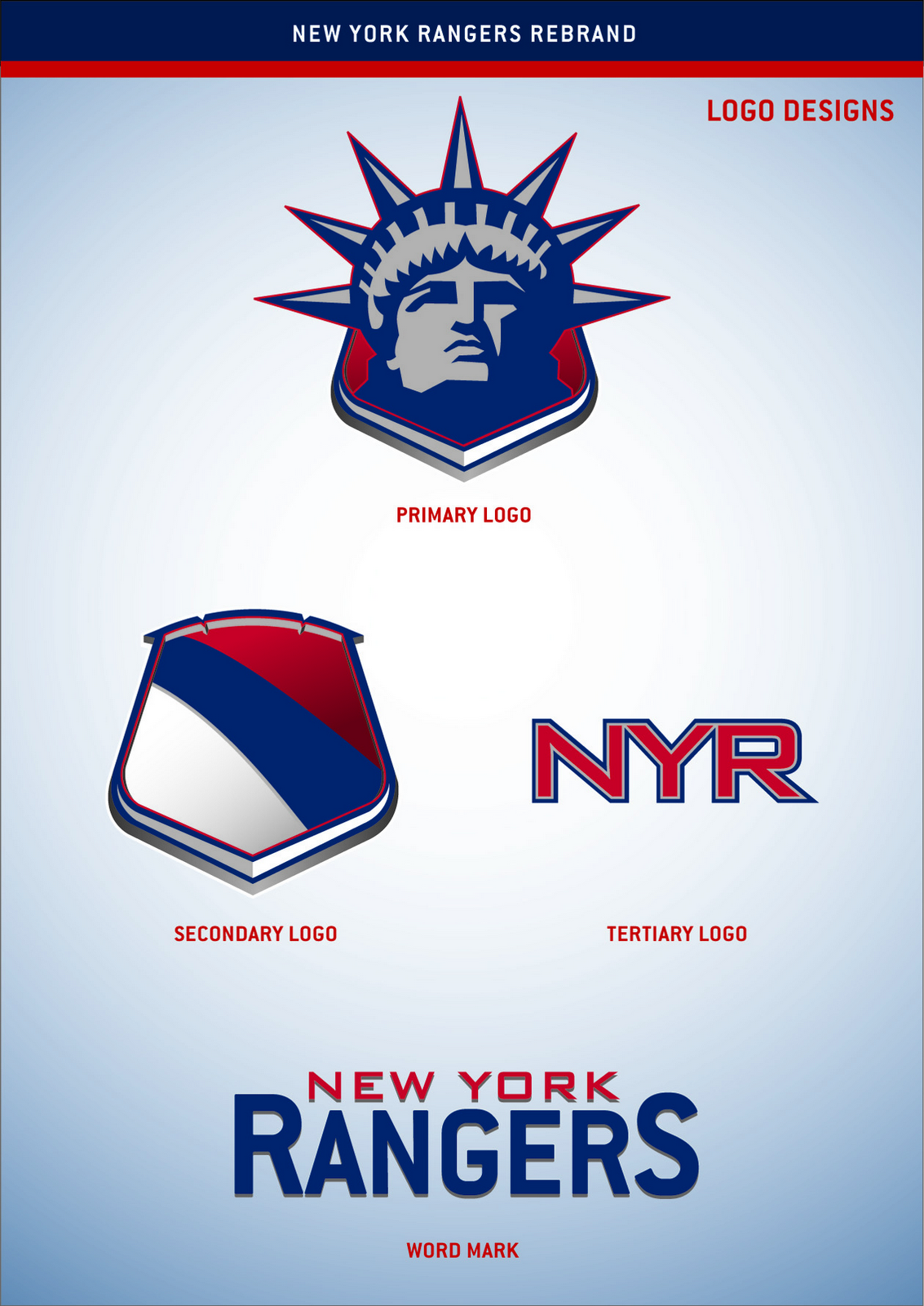
If you've been reading this blog a while, you know how much I love the Lady Liberty logo for the Rangers. Here are the uniforms to go with that logo set.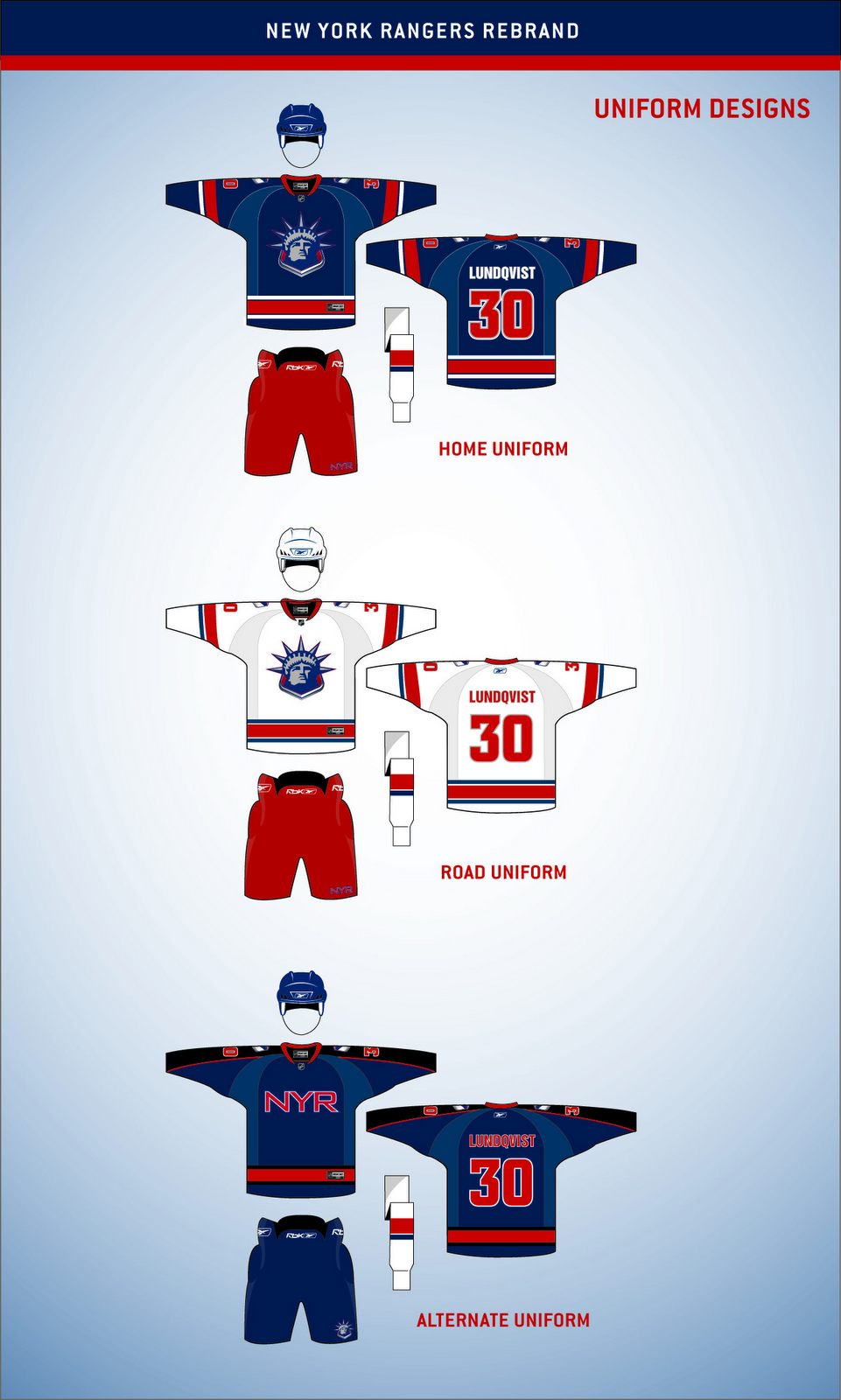
These work exceptionally well and I think that's hard to deny. Now I could go on and on about the quality of this artwork, but I'm more interested in reading what you guys have to say, so comment below.
But first, let's move on to the Ottawa Senators.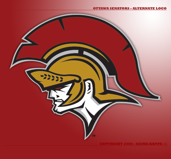
It's like a Hulked up version of the new alternate logo. Scary. Very scary.
Got a couple more neat designs before I call it a night, including a secondary logo for the Toronto Maple Leafs.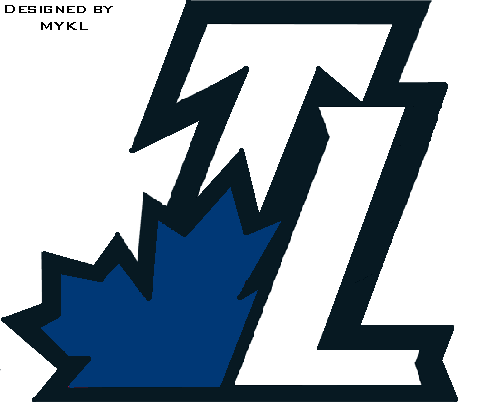
Or who knows, maybe it would even work as a primary. But I'm smart enough to know you guys don't like messing with tradition.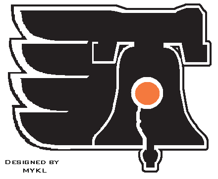
Then this here is just a Philadelphia Flyers logo incorporating the Liberty Bell.
So we begin and end with "liberty" today, apparently. Weird. Totally unintentional. Seriously though, drop us a line. I really want to read what you guys think of these logos, especially the Rangers. (Take a close look at that secondary mark.)
I hope to have more for you tomorrow.

33 comments:
That Leafs one is a redone Toronto Raptors logo, by the way.
That New York one is unbelieveable, and I thought that the shoulder patch should've been used on the third instead of the NYR. But either way works.
And the person who continues to create these logos (Devils, Predators, now Senators), you do a great job at taking what the team has an transforming it into something fresh. P.s. Would you mind creating a Leafs logo?
And, sorry, don't like that Philly one at all. It seems messy to me, but maybe a liberty bell part can be tried again.
2 got posted of mine
personally i like the flyers one, just thought id do it cause in an earlier post chris said he would like to see the liberty bell in a logo
and the leafs, i was looking at the rapters logos(where i got it)
thought it would be a good alt
look for created by mykl
thats me
the only one i like is the rangers that is amazing everyhting else isnt that good
I'm a big fan of the new Sens alternate logo, and this one is great in it's own right, I could definitely see it on merch and possibly even a third jersey.
The rangers logos, well what can I say, they're stellar, I would love to see them in action, even on the current jerseys. I think I might just mod that into my nhl game and link up some screen caps.
I really like that Rangers primary but make it an alt. Putting that new liberty logo on the old liberty jersey would work great. I don't like the other jersey designs either, no reason to change what works (shoulder lines especially).
Using the NYR as a logo, in my opinion, is over exposure. It works great as a helmet decal and for advertising stuff, but anything else and it starts to lose it allure.
The shield looks intriguing, but a little plain... maybe a shoulder patch on the "new" alternate?
And I really like that Ottawa logo; definitely better than what they have now.
THAT RANGERS ONE IS PERFECT!!!!!! The ontario ones are good, great take on the raptor logo, but that philly one is just not good.
I hate the Rangers, so I'd hate to see them get a look that good. It's a beautifully designed logo set. I'm not overly crazy about the NYR logo or the word mark, but the primary logo is fantastic and the secondary world work well on the shoulder. What about adding the NYR into the secondary?
Heck no on that Senators logo. That ranks up there with the new 2D logo in the Hall of Shame.
I really like the secondary NYR logo. It is so simple, but it stirs a great deal of admiration in me... One could probably invert the order of colors and use it on Russian national jersey, too...
That Rangers shield gives me a very Czech Republic vibe. This set is very sharp overall, but I'm not feeling the black on the 3rd unis.
Bizarro Senators (sorry Chris, the comic book geek in me has to correct the Hulk reference) one is nice too, but like most of (I think it's the same as the Preds and Devils guy) that artist's designs don't look like they'd work at the Pro level. Now stick that onto the AHL Binghamton Senators jersey and I think we'd have a winner.
Overall, nice post though.
The NYR ideas rock!
rangers is sick, sens scares me a little
i would have to say the west definately produced better concepts than the east.
I love the rangers concept but I'm not so fond of the other ones.
Someone has to come up with an amazing canucks concept. The whale drives me nuts.
the Ranger white reminds me of my favourite jersey of all time - the Toronto Toros of the old WHA.
I'm a huge Rangers fan, so I'll be honest, I was skeptical at first. Still, I love this identity system, but still would endorse some changes if used in-game.
1. The home sweater has to be the classic horizontal "RANGERS" down the front, but can be in the new font. Sorry, but tradition comes first.
2. Get rid of the "NYR" alternate jersey, and substitute in the primary home uniform from this identity system as the third uniform.
Besides that, great stuff.
I like the rangers branding, except for the NYR logo. I like the secondary logo, a lot.
You must be delirious. That Rangers set is just plain horrible. Looks like a knock-off from the WHA. Rangers would never stoop to wearing something that chessy. Don't mess with the original six. They're the hallmarks of league. Screw around all you want with the expansion teams. The liberty logo is way too gay and should be scrapped. Most native New York hockey fans hate it.
The Rangers one is awesome, although I'd use navy blue instead of the royal blue. Also, I'd stay away from the white socks with the home and the alternate should probably be the classic diagonal text crest, but this time navy instead of royal blue, but that's just me.
Very nice work.
The Leafs is way too interchangeable with some of the previous lighting concept from GFB...
Speaking of Matt, is there a timetable for his Sabres re-brand?
The Rangers concepts are the best I've seen on this site yet. The wordmark is a little plain, and the NYR and black sleeve is no good for the alternate, but the rest is fan-freaking-tastic.
Not a fan of the Senators, too angry.
The Leafs and Flyers, ah... no.
matt beat me to the punch. wanted to say that the rangers design looks great except for the white socks which feel really out of place with the two blue jerseys.
chuckd sucks, and Charlie posed an interesting question, WHEN IS MATTS SABRES REBRAND GONNA BE DONE?
Is it just me, or does the Rangers logo look like the person stole the Eastern Conference logo shield
I really like the Senators logo. It looks like a hockey team rather then something a kids team would wear.
The Rangers one really works. Sometimes they seem pretty crazy but not even being a rangers fan, I would probably buy the Blue (reg) jersey.
The Flyers and Maple Leafs ones, I really dislike.
Interesting ideas for the Rangers. To me, the word mark needed to be diagonal to preserve *some* tradition. And the third jersey would be something the Knicks would wear if it were a hockey team.
I dig the Rangers primary, because I've always been a fan of the Lady Liberty look. The alternate jersey seems too "Columbusy" to me, plus the plain "NYR" on the front looks bleak.
I have to admit that I don't understand the redone Leafs logo. "TL"? I get that it might indicate "Toronto Leafs," but that's more of a colloquialism. After all, the Rangers use "NYR" for "New York Rangers," and not "TBS" for "The Blueshirts."
The Sens' look is pretty wicked, I think.
That Philly Liberty Bell logo belongs on a Freak Out Friday post!
OK, whoever makes those logos, the Sens logo(awesome) and the preds one posted earlier, you could have a future in logo designing.
Not enough can possibly be said about that Rangers design. That "Lady Liberty" logo is PERFECT for the team because it represents not only New York but all of America. If they threw that crest on the front of their jerseys, the Rangers would definitely be by far the best-looking team in the league. That logo looks great on the jerseys, also.. of course anything would look better than "RANGERS".
i like the ideas, but leave the Rangers out of it.
the rangers primary and secondary should be switched
Post a Comment